Past covers of the Sierra Nevada Review:
http://www.sierranevada.edu/assets/SierraNevadaReview2012.jpg
http://www.sierranevada.edu/academics/humanities-social-sciences/english/the-sierra-nevada-review/poetry/
Covers of POETRY Magazine:
http://www.flickr.com/photos/89973526@N00/sets/72157604919202281/
Showing posts with label class-assignment. Show all posts
Showing posts with label class-assignment. Show all posts
Thursday, February 7, 2013


Thursday, April 21, 2011
DICTATORSHIP TO DEMOCRACY: Who's doing what
For the beginning of Tuesday's class, I want to see three worked-out sketches (three alternate versions) working out your visualization from the section of "From Dictatorship to Democracy" that you've been assigned. I want you to have at least three versions so you don't just get stuck on one visual idea -- and also, on Tuesday, when we look at all of your sketches, I'm hoping we might be able to cross-pollinate some of the visual ideas. I can see one concept being applicable to another concept, or perhaps there are "characters" for figures such as the dictator, the resister, etc., that could be applied across several of the ideas.
Here's the list of the sections (by number, corresponding to the numbering on the previous blog post), and who's doing what:
1: Brett
2. Jessica
3. Ethan B.
4. Ethan R.
5. E'Sha
6. Lane
7. Michele
8. Jasen
9. Keith
10. Trevor
11. Victor
12. Michael
Here's the list of the sections (by number, corresponding to the numbering on the previous blog post), and who's doing what:
1: Brett
2. Jessica
3. Ethan B.
4. Ethan R.
5. E'Sha
6. Lane
7. Michele
8. Jasen
9. Keith
10. Trevor
11. Victor
12. Michael
Wednesday, March 9, 2011
Footage Remixes
For reference for Thursday's class:
The Prelinger Archive:
http://www.archive.org/details/prelinger
Prelinger Television Commercials
Prelinger Tag Cloud
Rose Hobart:
http://www.youtube.com/watch?v=XnbbqiD7C7A&tracker=False
http://www.youtube.com/watch?v=lQVLLGzhLl0&tracker=False
Slap Chop rap:
Day Job Orchestra:
Everything Is Terrible:
The Prelinger Archive:
http://www.archive.org/details/prelinger
Prelinger Television Commercials
Prelinger Tag Cloud
Rose Hobart:
http://www.youtube.com/watch?v=XnbbqiD7C7A&tracker=False
http://www.youtube.com/watch?v=lQVLLGzhLl0&tracker=False
Slap Chop rap:
Day Job Orchestra:
Everything Is Terrible:
CREEPS N' SEX OBJECTS 4 KIDZ! from Everything Is Terrible! on Vimeo.
THE MAJESTY OF CHRISTMAS MUSIC from Everything Is Terrible! on Vimeo.
Wednesday, March 2, 2011
Finished Poster & Response Paper, due on Tuesday
At the beginning of next Tuesday's class, your finished poster design is due. Also, I want you to write a series of short responses to some questions, in reaction to an online reading assignment.
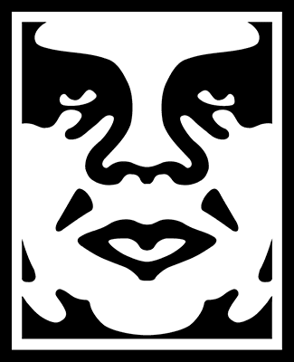
Here's the article on Shepard Fairey for you to read & respond to:
Obey Plagiarist Shepard Fairey, by Mark Vallen
Please answer the following questions, and send them in an email to my school email account before Wednesday's class:
1. Vallen suggests Fairey has no demonstrable drawing ability, calling his art "machine art that any second-rate art student could produce." Is this an accurate appraisal of Fairey's style? Is it a relevant critique? Explain why or why not, in each case.
2. Vallen suggests that Lichtenstein's appropriation of comic strip imagery is valid, while Fairey's is not. What is the distinction he draws between the two artists? And do you think it's a valid distinction?
3. Vallen claims that the rationale behind Fairey's "Obey Giant" campaign -- to "stimulate curiosity and bring people to question both the campaign and their relationship with their surroundings - because people are not used to seeing advertisements or propaganda for which the motive is not obvious" -- is "pointless twaddle." Does he have a point, or is this in fact a decent rationale? Why?
4. Did Fairey have any sort of responsibility to recognize the skull image from the "defiant since 89" T-shirt as an SS Skull? Why?
5. Was the use of the Koloman Moser figure for the "Obey Propaganda" poster appropriate? Did Fairey make the image his own, or does it stand too much in the shadow of the original image?
6. Is Fairey's addition of an "Obey" logo to a Black Panther's beret an act of commentary, appropriation, or something else? What does the addition of the "Obey" logo do to transform the meaning of the original image?
7. What do you think Fairey's transformation of Rupert Garcia's "Down with the Whiteness" poster ultimately means?
8. Should Fairey have issued an apology to Rene Mederos, for the use of his poster image on a T-shirt?
9. Do you think that Fairey's use of Gary Grimshaw's winged panther image violates the spirit in which it was created for the "public domain?" Grimshaw says as much: "It is an icon that people can identify with and organize around, and thus must be free of copyright restrictions and onerous ownership. That is the spirit in which the image was created. The commercial exploitation of this image is not strictly criminal because of its public domain intent, but it reeks of the very mean spirit that the image was meant to oppose." Does Grimshaw have a point, or is Fairey completely in the clear in this case?
10. Towards his conclusion, Vallen states: "The expropriation and reuse of images in art has today reached soaring heights, but that relentless mining and distortion of history will turn out to be detrimental for art, leaving it hollowed-out and meaningless in the process. When I refer to "mining" in this case I mean the hasty examination and extraction of information from our collective past as performed by individuals who do not fully comprehend it. That is precisely what Fairey is guilty of, utilizing historic images simply because he "likes" them, and not because he has any grasp of their significance as objects of art or history." Is this a vlid critique of Fairey's art? What responsibility does the artist have to the history and social context of art the imagery he/she chooses to appropriate, if any?

Here's the article on Shepard Fairey for you to read & respond to:
Obey Plagiarist Shepard Fairey, by Mark Vallen
Please answer the following questions, and send them in an email to my school email account before Wednesday's class:
1. Vallen suggests Fairey has no demonstrable drawing ability, calling his art "machine art that any second-rate art student could produce." Is this an accurate appraisal of Fairey's style? Is it a relevant critique? Explain why or why not, in each case.
2. Vallen suggests that Lichtenstein's appropriation of comic strip imagery is valid, while Fairey's is not. What is the distinction he draws between the two artists? And do you think it's a valid distinction?
3. Vallen claims that the rationale behind Fairey's "Obey Giant" campaign -- to "stimulate curiosity and bring people to question both the campaign and their relationship with their surroundings - because people are not used to seeing advertisements or propaganda for which the motive is not obvious" -- is "pointless twaddle." Does he have a point, or is this in fact a decent rationale? Why?
4. Did Fairey have any sort of responsibility to recognize the skull image from the "defiant since 89" T-shirt as an SS Skull? Why?
5. Was the use of the Koloman Moser figure for the "Obey Propaganda" poster appropriate? Did Fairey make the image his own, or does it stand too much in the shadow of the original image?
6. Is Fairey's addition of an "Obey" logo to a Black Panther's beret an act of commentary, appropriation, or something else? What does the addition of the "Obey" logo do to transform the meaning of the original image?
7. What do you think Fairey's transformation of Rupert Garcia's "Down with the Whiteness" poster ultimately means?
8. Should Fairey have issued an apology to Rene Mederos, for the use of his poster image on a T-shirt?
9. Do you think that Fairey's use of Gary Grimshaw's winged panther image violates the spirit in which it was created for the "public domain?" Grimshaw says as much: "It is an icon that people can identify with and organize around, and thus must be free of copyright restrictions and onerous ownership. That is the spirit in which the image was created. The commercial exploitation of this image is not strictly criminal because of its public domain intent, but it reeks of the very mean spirit that the image was meant to oppose." Does Grimshaw have a point, or is Fairey completely in the clear in this case?
10. Towards his conclusion, Vallen states: "The expropriation and reuse of images in art has today reached soaring heights, but that relentless mining and distortion of history will turn out to be detrimental for art, leaving it hollowed-out and meaningless in the process. When I refer to "mining" in this case I mean the hasty examination and extraction of information from our collective past as performed by individuals who do not fully comprehend it. That is precisely what Fairey is guilty of, utilizing historic images simply because he "likes" them, and not because he has any grasp of their significance as objects of art or history." Is this a vlid critique of Fairey's art? What responsibility does the artist have to the history and social context of art the imagery he/she chooses to appropriate, if any?
Monday, February 28, 2011
Due Tuesday: a sketch for your poster design
For those who weren't in Thursday's class -- what's due at the beginning of class Tuesday is a sketch for your poster design. Please select one of the bands in the "Band Links" section of this blog (top right) -- listen to some of their tracks, and pick the one whose music gives you the most in the way of visual ideas. This sketch is an assignment unto itself, with its own grade. It doesn't have to be completely worked out, but I don't want you starting Tuesday's class with a totally blank slate -- Tuesday will be a work period for working on the posters. The size format for the posters will be 11"x17".
Also, for those who weren't in Thursday's class, there's one more detail for the poster designs: you're
going to be making a 2-color poster. Of course, by overprinting colors, and by using the white of the paper itself, you can make a 2-color poster look like it has more than two colors -- but you're restricted to two color plates. Here are some examples of 2-color posters:


Also, for those who weren't in Thursday's class, there's one more detail for the poster designs: you're
going to be making a 2-color poster. Of course, by overprinting colors, and by using the white of the paper itself, you can make a 2-color poster look like it has more than two colors -- but you're restricted to two color plates. Here are some examples of 2-color posters:


Thursday, February 10, 2011
Assignment: Poster Artist Presentation

This assignment is due at the beginning of class on Thursday, 2/17.
As a prelude to our poster project, everyone is going to do an in-class presentation on a poster artist or a poster movement, so that we get exposed to a variety of poster styles and approaches. Feel free to present images in powerpoint, or as an image slideshow. Everyone will have 10 minutes to present and take questions. In addition to the presentation, you'll need to email me a minimum three page paper (double-spaced), which will serve as an outline of your presentation. That's three written pages -- not one written page and two pages of pasted-in images. If you want to include images as supplements to the three page paper, feel free. Include a fourth page that lays out your bibliography. If you can get your hands on some actual books to bring to class to show around, please do. There are a few poster art books in Prim Library.
In your presentation and paper, give a description of the artist/movement, and what the social context for the work was. Who was the audience for the posters? What sorts of messages were they trying to convey? Who paid for the posters to be made (if relevant -- some posters, like the May '68 posters, were not commissioned)? What made the posters interesting or unique? What made them stand out? In addition to giving some biographical and social context, pick out several images that interest you, and critique them in some detail. What sorts of formal decisions make the posters "work" (or fail to work, if you think they're bad posters?)
Single out at least two posters, and write about the following elements in each poster:
Describe the qualities of the fonts, and how they are used
Describe the use of color
Describe the use of imagery
Write about the balance between text and image, and the overall composition
Describe the communicative impact of the poster
You could break down the paper in this way:
1 page of personal/cultural background to the artist/movement
1 page dedicated to a specific poster
1 page dedicated to another specific poster
1 bibliography page
Below is a list of poster artists or poster movements to choose from. Plug the name or prase into Google images and pick something that appeals to you visually. Once you've chosen, write your choice in a "comment" to this blog post -- don't pick artists/movements that have already been "claimed" in the comments section (this is first-come, first-serve). You're not restricted to this list -- if you'd like to do a presentation on some other poster artist, just name them in the comments section.
This should go without saying, but don't plagiarize. You'll get caught, and that'll suck.
The Beautiful Angle Poster Project
Art Chantry
Brian Chippendale
Shepard Fairey
Rupert Garcia (chicano movement posters)
Eugène Grasset
Gary Grimshaw (psychedelic 60s posters)
Miss Amy Jo
Judge (judgeworks.com)
Frank Kozik
Strawberry Luna
May 1968 Posters (1968 Paris Uprising, 1968 Street Posters)
Rene Mederos (and Cuban poster artists of the 1960s)
Victor Moscoco
Alphonse Mucha (and Art Nouveau)
Polish movie posters (esp. Jan Lenica)
Print Mafia
Soviet Movie Posters (esp. The Stenberg Brothers)
Soviet propaganda Posters
Théophile Steinlen
Henri de Toulouse-Lautrec
US WW2 propaganda posters
(The top image is by Bay Area Chicana artist Ester Hernandez)
Tuesday, February 1, 2011
Sierra Nevada Review Cover
The text on the cover should read:
Sierra Nevada Review
There should also be the date: 2011
Other than that, it's free reign. Something that somehow references poetry would probably give you a leg up. If you're totally stumped, make a design that's like a rainbow, but not a rainbow.
Here are the two last covers:


Sierra Nevada Review
There should also be the date: 2011
Other than that, it's free reign. Something that somehow references poetry would probably give you a leg up. If you're totally stumped, make a design that's like a rainbow, but not a rainbow.
Here are the two last covers:


Tuesday, January 25, 2011
Logo Assignment
You will each be making a grand total of 9 logo designs for your business competition company. I want you to use three approaches to the logo design, and each of these approaches should have 3 variations (for a total of 9 versions).
The approaches should be as follows:
1. A text-only design (3 different versions, using different fonts or typographical layouts). The text doesn't have to be uniform - you can have some letters larger than others and so on. There should also be some variations in terms of color.
2. A design that integrates the text with an image or abstract symbol (like the swoosh of the Nike logo). Again, I want to see three distinct versions -- using different images or symbols, different type treatments, etc.
3. A design where an image (or abstract shape) is the dominant (and perhaps the only) element of the design. Again, give three distinct versions.
At the bottom of your page, I want you to list the emotional, psychological, or "connotative" qualities you are trying to convey with your design decisions. Separate out the categories of font, color palette, and symbol. An example might be, in the case of a design for a logo for the underwater power generators:
Typeface: no capitals, rounded letterforms -- giving a sense of a small-scale, unintimidating, eco-friendly company.
Color palette: the use of blue connects to the idea of hydro-power, while the use of yellow is meant to convey energy, and electricity.
Symbols: The shape is meant to reference the shape of a wave, since the power is coming from a water source.
You may have to list out different properties for different designs, if your designs go aggressively in different directions.
The approaches should be as follows:
1. A text-only design (3 different versions, using different fonts or typographical layouts). The text doesn't have to be uniform - you can have some letters larger than others and so on. There should also be some variations in terms of color.
2. A design that integrates the text with an image or abstract symbol (like the swoosh of the Nike logo). Again, I want to see three distinct versions -- using different images or symbols, different type treatments, etc.
3. A design where an image (or abstract shape) is the dominant (and perhaps the only) element of the design. Again, give three distinct versions.
At the bottom of your page, I want you to list the emotional, psychological, or "connotative" qualities you are trying to convey with your design decisions. Separate out the categories of font, color palette, and symbol. An example might be, in the case of a design for a logo for the underwater power generators:
Typeface: no capitals, rounded letterforms -- giving a sense of a small-scale, unintimidating, eco-friendly company.
Color palette: the use of blue connects to the idea of hydro-power, while the use of yellow is meant to convey energy, and electricity.
Symbols: The shape is meant to reference the shape of a wave, since the power is coming from a water source.
You may have to list out different properties for different designs, if your designs go aggressively in different directions.
Monday, January 17, 2011
Welcome for 2011, and the first assignment
Welcome to the Blog for the Intermediate Digital darkroom class: Art & Advertising.
For the next class (Thurs), I want you to have ready, at the beginning of class, two things:
1. Create a blog post, on this blog, about a logo design you think is particularly good. Include an image of the logo. Be prepared to answer the question: why do you think this logo is a good design? Be sure to touch on at least these three areas:
a) color
b) font
c) imagery (if imagery is used)
Explain the emotional or psychological qualities that are conveyed by the formal choices in these areas. For example, if the font uses a bright, vibrant color, is it being used to convey a sense of excitement? Energy? What are the company's qualities that are being cued by the formal choices?
2. After having read the three articles posted below, type out and print a page of answers to the following questions:
In response to the Obama 'O' logo article: Why were the designers so concerned about having standards and consistency around the reproductions of the logo? What would the dangers have been if the logo seemed too "branded" or "slick"? Make a list of the specific qualities or emotions you think the logo evokes (or intends to evoke), and pair each quality with a design element (for example, one emotion it intends to evoke is "patriotism," and it does this by incorporating the colors red, white, and blue).
In response to the Pepsi articles: Do you agree with the designer that the new logo "brings humanity back" to the Pepsi? What do you think he means by that? What design choices were made to make the logo seem more "adventurous" and "youthful"? Do you think the design succeeds in those categories? What are the emotional qualities of the new font choice? Why is changing a logo so costly?
Here are the articles:
The 'O' in Obama
What went into the Updated Pepsi Logo
Thoughts about Pepsi
That last post is on a site, logodesignlove, that has some terrific resources, for example:
Links to free vector files for logos
A list of logo design resources
And here's a link to "Merchants of Cool," if you ever want to revisit it, or dig info some further research/supporting materials on it:
http://www.pbs.org/wgbh/pages/frontline/shows/cool/
Lastly, you can download the syllabus here:
http://www.box.net/shared/h4dyqkuea6
For the next class (Thurs), I want you to have ready, at the beginning of class, two things:
1. Create a blog post, on this blog, about a logo design you think is particularly good. Include an image of the logo. Be prepared to answer the question: why do you think this logo is a good design? Be sure to touch on at least these three areas:
a) color
b) font
c) imagery (if imagery is used)
Explain the emotional or psychological qualities that are conveyed by the formal choices in these areas. For example, if the font uses a bright, vibrant color, is it being used to convey a sense of excitement? Energy? What are the company's qualities that are being cued by the formal choices?
2. After having read the three articles posted below, type out and print a page of answers to the following questions:
In response to the Obama 'O' logo article: Why were the designers so concerned about having standards and consistency around the reproductions of the logo? What would the dangers have been if the logo seemed too "branded" or "slick"? Make a list of the specific qualities or emotions you think the logo evokes (or intends to evoke), and pair each quality with a design element (for example, one emotion it intends to evoke is "patriotism," and it does this by incorporating the colors red, white, and blue).
In response to the Pepsi articles: Do you agree with the designer that the new logo "brings humanity back" to the Pepsi? What do you think he means by that? What design choices were made to make the logo seem more "adventurous" and "youthful"? Do you think the design succeeds in those categories? What are the emotional qualities of the new font choice? Why is changing a logo so costly?
Here are the articles:
The 'O' in Obama
What went into the Updated Pepsi Logo
Thoughts about Pepsi
That last post is on a site, logodesignlove, that has some terrific resources, for example:
Links to free vector files for logos
A list of logo design resources
And here's a link to "Merchants of Cool," if you ever want to revisit it, or dig info some further research/supporting materials on it:
http://www.pbs.org/wgbh/pages/frontline/shows/cool/
Lastly, you can download the syllabus here:
http://www.box.net/shared/h4dyqkuea6
Subscribe to:
Posts (Atom)