You will each be making a grand total of 9 logo designs for your business competition company. I want you to use three approaches to the logo design, and each of these approaches should have 3 variations (for a total of 9 versions).
The approaches should be as follows:
1. A text-only design (3 different versions, using different fonts or typographical layouts). The text doesn't have to be uniform - you can have some letters larger than others and so on. There should also be some variations in terms of color.
2. A design that integrates the text with an image or abstract symbol (like the swoosh of the Nike logo). Again, I want to see three distinct versions -- using different images or symbols, different type treatments, etc.
3. A design where an image (or abstract shape) is the dominant (and perhaps the only) element of the design. Again, give three distinct versions.
At the bottom of your page, I want you to list the emotional, psychological, or "connotative" qualities you are trying to convey with your design decisions. Separate out the categories of font, color palette, and symbol. An example might be, in the case of a design for a logo for the underwater power generators:
Typeface: no capitals, rounded letterforms -- giving a sense of a small-scale, unintimidating, eco-friendly company.
Color palette: the use of blue connects to the idea of hydro-power, while the use of yellow is meant to convey energy, and electricity.
Symbols: The shape is meant to reference the shape of a wave, since the power is coming from a water source.
You may have to list out different properties for different designs, if your designs go aggressively in different directions.
Tuesday, January 25, 2011
Thursday, January 20, 2011


Wednesday, January 19, 2011
Jessica's Logo: NASA
This is the logo for the National Aeronautics and Space Administration. I chose this logo because I like how clearly it communicates the point. The stars represent outer space, and the white circle around the lettering looks like a comet or an orbiting satellite. The red shape is a wing representing aeronautics (until I looked it up, I thought it was a flame or just a shape implying movement).

My Logo

This is my logo of choice. It is the Thundercats logo. The color scheme is simplistic but pops a dramatic/epic bold image of some feline creature. This logo depicts a theme to me feels honorable, courage able, and inspirational in nature.
Tuesday, January 18, 2011
logo lane likes
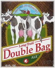 This is a Logo I like
Being from the great state of New Hampshire, I love to sample lots of local brews, and loving beer. I have found that Vermont is one of the best states in the US for beer. I love the unique taste of varieties of dark beers. This beer is called double bag because it has double the malts, hopps, etc. They did a great job of displaying two bags with the cows. The white colors make the red really poppy, dragging one to the center, with the red barn at the top. The font is super basic, keeping it simple is keeping it good. If it was more complicated it may take away from the image. The background color thatch really help bring one to the middle also. This is the best beer invented to man.

Monday, January 17, 2011
Welcome for 2011, and the first assignment
Welcome to the Blog for the Intermediate Digital darkroom class: Art & Advertising.
For the next class (Thurs), I want you to have ready, at the beginning of class, two things:
1. Create a blog post, on this blog, about a logo design you think is particularly good. Include an image of the logo. Be prepared to answer the question: why do you think this logo is a good design? Be sure to touch on at least these three areas:
a) color
b) font
c) imagery (if imagery is used)
Explain the emotional or psychological qualities that are conveyed by the formal choices in these areas. For example, if the font uses a bright, vibrant color, is it being used to convey a sense of excitement? Energy? What are the company's qualities that are being cued by the formal choices?
2. After having read the three articles posted below, type out and print a page of answers to the following questions:
In response to the Obama 'O' logo article: Why were the designers so concerned about having standards and consistency around the reproductions of the logo? What would the dangers have been if the logo seemed too "branded" or "slick"? Make a list of the specific qualities or emotions you think the logo evokes (or intends to evoke), and pair each quality with a design element (for example, one emotion it intends to evoke is "patriotism," and it does this by incorporating the colors red, white, and blue).
In response to the Pepsi articles: Do you agree with the designer that the new logo "brings humanity back" to the Pepsi? What do you think he means by that? What design choices were made to make the logo seem more "adventurous" and "youthful"? Do you think the design succeeds in those categories? What are the emotional qualities of the new font choice? Why is changing a logo so costly?
Here are the articles:
The 'O' in Obama
What went into the Updated Pepsi Logo
Thoughts about Pepsi
That last post is on a site, logodesignlove, that has some terrific resources, for example:
Links to free vector files for logos
A list of logo design resources
And here's a link to "Merchants of Cool," if you ever want to revisit it, or dig info some further research/supporting materials on it:
http://www.pbs.org/wgbh/pages/frontline/shows/cool/
Lastly, you can download the syllabus here:
http://www.box.net/shared/h4dyqkuea6
Subscribe to:
Posts (Atom)