Wednesday, April 29, 2009

Monday: Focus Art


Next project: your "Focus Group" piece. Before next class, you have to come up with a questionnaire that you will present to five people, to determine the "ideal" piece of digital art which that group of people would like. The questionnaire should have at least 10 questions, though you could develop more if you feel that would help focus things in an interesting way. The five people you survey should form some sort of "community" -- however you want to define it. They could be members of a family, students at a school, patrons of a particular supermarket, members of a church. The type of community you decide upon may inform the nature of the questions themselves. Just to be super-obvious, if you're surveying the members of a church, a question might be: "Do you prefer religious figures in your art?"

If you want to look at the surveys Komar and Melamid thought up for their "Most Wanted Painting" project as a jumping-off point, the surveys and painting can be found at this site:

http://www.diacenter.org/km/index.html

By Monday, you should have your questionnaire, and your surveys should be completed. Monday will be a work period for working on executing your focus group artwork -- it will be due at the beginning of the final, Monday May 11, at 11:30.

Also, for those of you who had your posters picked, here are the dates you should slot in. It would be good to have these by next class.

Cody: May 21 at Moody's
Logan: May 22 at Bite
Sam: May 30 at Moody's

Thursday, April 23, 2009

Monday: Poster review & appropriated footage crit


Don't forget -- Brian will be coming in Monday at 3pm to look at the posters. So you gotta have your $5 so we can print the suckers out.

Also, your appropriated footage project is due at the beginning of class.

Tuesday, April 21, 2009

For Wednesday

Please have: your final poster file, and $5 to print it out.

We'll also have time in class to finish up your appropriated footage project.

Sunday, April 12, 2009

For the week that I'm out

Hey there -- you should all be working on your two projects, the "making art out of non-art" and the "appropriated footage" project. Between the two, you should be pretty well-occupied. Your "making art out of non-art" project is due the Monday I get back, April 20th -- so be ready, by the beginning of that class, to present and have a crit on that work. Your appropriated footage project will be due on the Wednesday after, April 22nd.

Lastly -- don't forget to keep the "panopticon" project rolling. Keep passing along that file and adding your own web images.

Monday, April 6, 2009

Due Wednesday

Come to class prepared to give an update on your "turning non-art into art" project at the beginning of class.

Also, bring links or DVDs to class so that we can prepare the raw materials for the "found footage" project. If you want to check out some of the stuff I screened again (or view some of the thing in full that I only screened partially), here are some links:

http://www.youtube.com/watch?v=mTarJ0Op7W8
http://www.youtube.com/watch?v=HAMFHT6BGO0
http://www.youtube.com/watch?v=1Leg3D3rUXo
http://www.youtube.com/watch?v=drDPbKquQVw

Monday, March 30, 2009

Wednesday's class -- what's due


1. Bring your print-ready poster file, PLUS $5 TO COVER THE COST OF PRINTING -- I'd like to have the posters printed out by the end of Wednesday's class.

2. Have a start to your "making art out of non-art" project. This will include an object of your choice, and a brief write-up of your strategy for turning that object into art.

As I said in class, since all of our projects so far have been focused in the commercial art zone -- bringing artfulness to commercial art -- this next project will be an attempt to travel in the other direction -- to take something that seems to not be art, and bring it into the zone of art. You don't have to use Warhol as a visual model, but think of how he took ordinary, everyday objects, and brought them into the realm of art. This wasn't limited to the soup cans and Brillo boxes -- it also functioned in the way he used crime scene and celebrity photos, and in the way he used film to capture or "notice" things that otherwise hadn't been noticed by art. He took things and moments that most people pass by, and made them stop and look at them in new ways. I'd like you to try and perform a similar trick (which is fundamentally a trick of re-framing) with some object or image that most people barely notice. What is something most people would not think of as "art," and how can you make art out of it?

You don't necessarily have to use digital means for this project. You could do something sculptural-- or heck, even something performative. You could use the object/image itself, or you could somehow translate or reproduce its qualities through some other means.

Part of this assignment is an exercise in "curation" -- how interesting your final project is will probably be related to how interesting a choice of object you make. Warhol in many ways was a successful curator -- it was less about creating objects, than choosing potent images that were slipping past in the stream of mass culture.

Bring the object you are intending to transform, AND A PROPOSAL FOR HOW YOU WILL MAKE THE THING INTO ART -- write up a paragraph or two explaining your strategy of "art-ification." If you want to include sketches, that would be fine, too. Make sure you're able to communicate the basic idea of your project.

Tuesday, March 24, 2009

What's due on Monday, March 30

Your poster design should be print-ready by the beginning of class on Monday. So pretty it up, try out some variations, and knock my socks off.

Monday, March 23, 2009

QMO refs

Here's a past QMO poster:


Here are some Blue Note covers:

http://www.pixagogo.com/7180565202

Sunday, March 15, 2009

Mucha images


The "Golden Age Comic Book Stories" blog recently posted up several lovely images by Mucha -- click on the pics at the blog to see higher-res versions. It's really lovely stuff.

Wednesday, March 11, 2009

Moody's or Baxters


Look them up online to see aesthetics and atmosphere.

moodysbistro.com
Baxters is under the northstar website.
The Musician are:

Brian Hess
Steve Saturno
Todd Holway

Monday, March 9, 2009

QMO

this is quite possibly the worst photo of these guys, but perhaps you can use it...?

Wednesday, March 4, 2009

Due Monday, March Ninth, in the Year of Our Lord Two Thousand and Nine

At the beginning of Monday's class, I want to see three things.

1. A response to a reading -- the critique of the Shepard Fairey critique (see questions at the bottom of this blog post).

2. An image for the Sierra Nevada Review cover (Logan has specs below, in the previous blog post -- thanks Logan). The text for the cover is: "The Sierra Nevada Review -- Volume 20 -- 2009" and you can see more covers here. We'll kick these covers out over the course of Monday's class.

3. Visual ideas and materials for you to start work on the Quartet Minus One posters. I'll post some visual references that Brian suggested sometime soonish. You can hear some of there music on this page.

Here's the link, and the questions, for the reading:

SuperTouch's editorial "The Medium is the Message: Shepard Fairey and the Art of Appropriation" -- be sure to read Fairey's short 1990 manifesto at the end of the article. By the beginning of class, please email me your response to the following questions:

1. Are you familiar with the phrase "The Medium if the Message"? How would you explain what it means (feel free to look it up -- it was originated by Marshall MacLuhan)? If the "medium" of Fairey's art is the street poster, the sticker, and the T-Shirt, how does that shape the message? Does the medium, in this case, expand or constrict the possibilities for Fairey's message?

2. The SuperTouch editorial states: "By taking precisely the elements of an image that speak of its historical meaning and original context and incorporating them into a new image, an artist creates a visual comparison, juxtaposing new and old. Such a contrasting is inherent in the act of referencing, and the intended result is for viewers to consider the relationship of the two images and hopefully spark a dialogue..." Do you think this is a sufficient artistic aim for any act of referencing, or is it possible to distinguish between "good" referencing and "bad" referencing? What would be your criteria?

3. Are the SuperTouch editorial's defenses of the Black Panther, Rupert Garcia, and MC5 appropriations convincing or not?

4. If Fairey's work cultivates an "intentional ambiguity," does that place a limit on the sort of things his art can be about? Where do you think his art could go from here?

5. What do you think of Fairey's 1990 manifesto? Does it make a convincing case for his "Obey" strategy?

The SNC Review - Covers

So here's the scoop. The cover for the Review measures 5.5" x 8.5". If you want to include the back cover, its obviously will be the same size, but also compensate for a roughly .25" spine which typically is just text.

I'll ad the covers from past issues between last year and 2001-ish. Sorry for the questionable photos, only had my webcam.

Make sure any submissions are print-quality. 300 dpi.


Monday, March 2, 2009

Response paper due by next Wednesday's class


Here's the article on Shepard Fairey for you to read & respond to:

Obey Plagiarist Shepard Fairey, by Mark Vallen

Please answer the following questions, and send them in an email to my school email account before Wednesday's class:

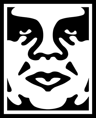
1. Vallen suggests Fairey has no demonstrable drawing ability, calling his art "machine art that any second-rate art student could produce." Is this an accurate appraisal of Fairey's style? Is it a relevant critique? Explain why or why not, in each case.

2. Vallen suggests that Lichtenstein's appropriation of comic strip imagery is valid, while Fairey's is not. What is the distinction he draws between the two artists? And do you think it's a valid distinction?

3. Vallen claims that the rationale behind Fairey's "Obey Giant" campaign -- to "stimulate curiosity and bring people to question both the campaign and their relationship with their surroundings - because people are not used to seeing advertisements or propaganda for which the motive is not obvious" -- is "pointless twaddle." Does he have a point, or is this in fact a decent rationale? Why?

4. Did Fairey have any sort of responsibility to recognize the skull image from the "defiant since 89" T-shirt as an SS Skull? Why?

5. Was the use of the Koloman Moser figure for the "Obey Propaganda" poster appropriate? Did Fairey make the image his own, or does it stand too much in the shadow of the original image?

6. Is Fairey's addition of an "Obey" logo to a Black Panther's beret an act of commentary, appropriation, or something else? What does the addition of the "Obey" logo do to transform the meaning of the original image?

7. What do you think Fairey's transformation of Rupert Garcia's "Down with the Whiteness" poster ultimately means?

8. Should Fairey have issued an apology to Rene Mederos, for the use of his poster image on a T-shirt?

9. Do you think that Fairey's use of Gary Grimshaw's winged panther image violates the spirit in which it was created for the "public domain?" Grimshaw says as much: "It is an icon that people can identify with and organize around, and thus must be free of copyright restrictions and onerous ownership. That is the spirit in which the image was created. The commercial exploitation of this image is not strictly criminal because of its public domain intent, but it reeks of the very mean spirit that the image was meant to oppose." Does Grimshaw have a point, or is Fairey completely in the clear in this case?

10. Towards his conclusion, Vallen states: "The expropriation and reuse of images in art has today reached soaring heights, but that relentless mining and distortion of history will turn out to be detrimental for art, leaving it hollowed-out and meaningless in the process. When I refer to "mining" in this case I mean the hasty examination and extraction of information from our collective past as performed by individuals who do not fully comprehend it. That is precisely what Fairey is guilty of, utilizing historic images simply because he "likes" them, and not because he has any grasp of their significance as objects of art or history." Is this a vlid critique of Fairey's art? What responsibility does the artist have to the history and social context of art the imagery he/she chooses to appropriate, if any?

Wednesday, February 25, 2009

For next Monday: An improved Envy Ad

By the beginning of Monday's class, please have your improved Envy Ad (brought up to looking professional, incorporating some of the feedback in the crit). You won't have to print it out again, but we will look at the revised product.

Thursday, February 19, 2009

I meant double-spaced

Just a quick note -- I had a brain misfire, and when I originally posted the specs for the next assignment, I wrote "three single-spaced pages" when I meant "three double-spaced pages." I've fixed it in the original blog post below, but just wanted to underline the mistake, if you'd already read the original blog post.

Wednesday, February 18, 2009

Selecting hair out of a BG tutorials

Cody asked about this -- here are some links to tutorials that show how to extract people from backgrounds, with difficult outlines around hair (or other fine details):

This is probably the best, though it's also the most complicated:

http://www.graphic-design.com/Photoshop/remove_backgrounds/index.html

Here are two other techniques that are quicker, but less comprehensive:

http://www.planetphotoshop.com/selecting-frizzy-hair.html

http://www.photoshopsupport.com/elements/tutorials/extract-hair/masking-tutorial.html

Due Next Monday: Logo & Envy Ad -- plus, get started on the Poster Presentation


For next class -- Monday -- be prepared to print out both your finished logo page, and your "envy" ad. Bring $4 to class to pay for the prints (it costs $2 per sheet). We'll look at them and critique them in Monday's class.

Also -- this assignment won't be due until a week from today, but you should get a head start on it -- don't wait until tuesday and scramble to put it together at the last minute. As a prelude to our poster project, everyone is going to do an in-class presentation on a poster artist or a poster movement. Feel free to present images in powerpoint, or as an image slideshow. Everyone will have 10 minutes to present and take questions. In addition to the presentation, you'll need to email me a minimum three page paper (double-spaced), which will serve as an outline of your presentation. That's three written pages -- not one written page and two pages of pasted-in images. If you want to include images as supplements to the three page paper, feel free. Include a fourth page that lays out your bibliography (I want you to use at least four separate sources). If you can get your hands on some actual books to bring to class to show around, please do. There are a few poster art books in Prim Library

In your presentation and paper, give a description of the artist/movement, and what the social context for the work was. Who was the audience for the posters? What sorts of messages were they trying to convey? Who paid for the posters to be made (if relevant -- some posters, like the May '68 posters, were not commissioned)? What made the posters interesting or unique? What made them stand out? In addition to giving some biographical and social context, pick out several images that interest you, and critique them in some detail. What sorts of formal decisions make the posters "work" (or fail to work, if you think they're bad posters?) Talk about the use of images, the use of composition, the use of color. Talk about how text and fonts are used in the posters.

Here are the poster artist assignments, assigned to each student:

Théophile Steinlen -- Victoria
Alphonse Mucha (and Art Nouveau) -- Heather
May 1968 Posters (look up 1968 Paris Uprising, 1968 Street Posters) -- Logan
Polish movie posters (esp. Jan Lenica) -- Nick
Soviet Movie Posters (esp. The Stenberg Brothers) -- Thomas
Rene Mederos (and Cuban poster artists of the 1960s) -- Drew
Gary Grimshaw (psychedelic 60s posters) -- Jenn
Victor Moscoco (psychedelic) -- Chelsea
Rupert Garcia (chicano movement posters) -- Sam
The Beautiful Angle Poster Project -- Cody
Shigeo Fukuda -- Matt

The above image is by Bay Area Chicana artist Ester Hernandez

Wednesday, February 11, 2009

What's due in a week (next Wed., Feb. 18)

By the beginning of next class, please have:

1. Your finalized logo. On an 8.5"x11" Illustrator document, place one large version of the logo, and two small versions of the logo (no larger than 1" across). The large versions and one of the small versions should be in full color, and the second small version should be a black and white version (obviously, if your logo is only in Black and White, you only need the one small version). You can lay out the page in landscape format if that gives you more space to make the large version bigger.

2. A good start on your next project, the magazine ad selling something you envy. The Berger article made the argument that envy is a powerful engine for advertising; for this project, I want you to identify something you personally envy, and craft a magazine ad selling that thing. You can think of it as an ad with a very targeted demographic: yourself. It doesn't necessarily have to be an object that you envy -- it could be something less tangible, like a lifestyle, a talent, a social position. Just identify something you're envious of, and think of an ad that would make you envy it more.

The ad could have a photo (or photos), or it could use illustrations (or it could be a combination of illo and photo) -- and it MUST have some text to it as well. The text could be a sort of tagline, or something more developed. Go to a magazine stand and look over the ads if you need ideas for the sort of text and text layout you want to use. I want you to integrate text and images using illustrator as a tool. If you are shooting photos for this project, please have them shot before next class, so that you can being putting the ad together in class. Whatever your approach will be, I want a fairly worked-out sketch of your ad at the beginning of Wednesday's class.

The last element of this project: I want your presence to be felt in the ad. That doesn't mean that you need to have a picture of yourself directly in the ad (though you can do that, if you want) -- there could be a figure who is a symbolic stand-in for your feeling of envy. Or perhaps your presence is implied, but stands outside of the page itself. But I want this ad to be very personal to yourself.

Wednesday, February 4, 2009

Assignment for Monday's class


So -- next class we'll be completing the logo presentations. We'll also discuss the article I handed out -- the chapter from "Ways of Seeing." And you need to bring a magazine ad to class, to discuss in conjunction with the article (see #6 below).

Before Monday, email me a response paper to the handout. I want you to answer the following questions:

1. On p.131, Berger writes: “Within publicity, choices are offered between this cream and that cream, that car and this car, but publicity as a system makes a single proposal. It proposes to each of us that we transform ourselves, or our lives, by buying something more.” Do you think that’s accurate, or do you think publicity, as a system, offers other proposals as well? List two or three more proposals the system of publicity makes.

2. Berger talks of how images from Fine Art have been used to generate an air of “prestige” in advertising. Is this still the case, or is that approach now outmoded in advertising? What, if anything, has replaced Fine Art as a generator of “prestige” in publicity?

3. On p.140, Berger writes "Publicity makes all history mythical." What does he mean by that, and how does it apply the the Pepsi commercial, spanning the various youth movements, we watched a few classes ago?

4. Following Berger's definition of "glamour," what makes "glamour" different from qualities such as wealth, beauty, and talent?

5. On p.149, Berger writes: "Publicity turns consumption into a substitute for democracy." What does he mean by this, and do you agree or disagree? Why?

6. Berger writes that the "absent, unfocused look of so many glamour images" is due to the fact that the models "look out over the looks of envy which sustain them." Find a magazine ad in which you can identify that look, and bring it to class. Be prepared to answer the question: what, exactly, is the viewer supposed to be envying in this ad? Is it an envy you share? And how would it be possible for you to possess, in practical terms, that thing which you envy?

Monday, February 2, 2009

Due next class (Wednesday)

So, your 15 logo designs are due at the beginning of next class. Give some thought on how you'll present them. Will you show all the font-based ones together, on one screen? Or will you build out a slideshow to show off each design individually? You will actually "pitch" these designs to the class -- we'll be your client, and you have to impress us with the reasoning behind your design choices. We should really have a feel that the values of our company are reflected in the logo.

WOW Thats An AWSOME Chip

While watching the superbowl I saw this add and this happens to be my favorite. It mad me laugh and I really wanted some Doritos so I found it effective.

Exaggerated graphic is what I would call this because eating a dorito is like having a magical chip which can do anything.
Plus is very funny

Debt

This is an ad campaign that we are all familiar with. Master Card has used a number of the 12 different ad tactics in there priceless campaign. Predominantly they are using an on going characters and celebrities approach. In essence Master Card has transcended there first ad in the priceless campaign and now little articulation is necessary for user product association. I enjoy the simple clean imagery and soft tone to the ads.


Fancy A Crisp?


One of the newer Geico Gecko ads is an "ongoing characters" type of ad. Multiple ads have been run over the years staring the witty little gecko and often there is some sort of dialogue going on that speaks to the quality of insurance that Geico provides. Geico seems to like these ads, with most of them either being the Gecko or the Caveman ads.

my first blog!

The ad that i decided to bring in, is the add that was aired during the Super-Bowl. I think that this add would fall under the "associated user imagery". i think this because of the uses of good imagery to show just how good the Doritos are, by throwing a "cristal ball" at the vending machine just to get free Doritos. it also show who is using the product and he is goofy and or geeky.

this advertisement from New Zealand is a PARODY/ BORROWED FORMAT. The use of colloquial syntax and words relates to the intended market.Bugger me.

MacGuber Pepsi Ad

I saw this Pepsi ad yesterday during Superbowl commercials.  

This ad parodies the show MacGyver, making it a "parody or borrowed format" type ad.  The intro to the ad, with its Red MacGuber text, close-up shots, and explosions, is Pepsi's over-exaggerated and humorous take on MacGyver.  Pepsi promotes there product by having "MacGuber" drink and show off their product, even in the worst of times!  


Sunday, February 1, 2009

An AD I find interesting

I found this ad very interesting. It's a Japanese ad for Google Chrome. I think the design aesthetics are great. Wooden toys and alternative parenting is so "hip" these days and this ad plays on that trend. In the past few months I have seen countless magazines, blogs and websites dedicated to alternative parenting popping up. Google took the tech look out of their commercial to illustrate a point. 
They used the very basic POG game format to illustrate the simple nature of using Chrome. Its easy, fast and fun! Perhaps pepsi should have consulted with Google on how to "bring the humanity back", because I think google was fairly successful with this ad. I think they are trying to appeal to the bloggers and the younger web users. I personally like the ad, but hey, I am probably who they are marketing to. 

This ad brings me right back to childhood (as does the little ditty that starts it out).
I think this ad is a good example of Symbol Analogy (growing muscles and balloon head), however since it was always played on kid friendly stations it is also Associated User Imagery. 


I had to ad this one also. Brings me right back! ha

Friday, January 30, 2009

A couple of sites to checkout


Worth1000 - This site is mostly known for all of their Photoshop contests, but under the "Jackpot" tab are contests for logo designs... and the winners are paid for their designs!


Just Creative Design - A growing graphic design company's website that not only offers logo design services, but offers aspiring logo designers valuable information on how to get jobs, the latest design trends, interviews with artists, and more! 

Wednesday, January 28, 2009

Reading and assignment for next Monday's class

We'll continue with the logo design through next class period -- that will be the last in-class period to work on the logo designs. The 15 versions of the logo will be due at the beginning of class next Wednesday (a week from today). From there. we'll review the logos, pick out the most promising design(s), and work on refining those designs.

For next class, please read the article:

There Are 12 Kinds of Ads in the World, by Seth Stevenson (click open the slideshow on the linked page).

And before next class, please post to the blog an ad (it could be print or video), and write which of the 12 ad types you think it is, giving supporting examples for your classification.

Monday, January 26, 2009

Assignments and Resources for next Wednesday's class

For next class, please bring:

1. A graphic of (or a link to) a logo that you think is well-designed. Be prepared to answer the question: why do you think this logo is a good design? (We didn't get to this in class today, so we'll catch up with it on Wednesday).

2. A start to your logo assignment. It would probably be good to have a sheet of sketches for several logo ideas. I will want to see 15 prospective variations of your logo design, broken down as follows:

a) Five logos that are purely font-based (you can, and probably should, tweak with the font letterforms, but the logo itself should be formed only out of text)

b) Five logos that also incorporate some sort of abstract shape that somehow supports the "tone" of the business (for example, the Nike "swoosh," which is an abstract shape, but which connotes speed, energy, etc)

c) Five logos that incorporate some sort of pictographic "icon" -- a simplified version of something representational (for example, the way the NBA logo has a silhouette of a basketball player)


Here are some resources that might be helpful:

Free fonts:

1001fonts

dafont

fonts4free

Illustrator tutorials:

Using blend shapes to make a vector flower petal

3D in Illustrator:

3D logo

3D vase

Wednesday, January 21, 2009

What's due on Monday's class

For the next class, I want you to have ready, at the beginning of class, three things:

1. Have your choice for the logo you're going to design. As I said, it could be a logo for a business of your own or for a business of a friend's, it could be a logo for yourself, or you could choose to make a logo for a fictional business -- but you have to choose what this fictional business fictionally does. For instance, a logo for an ecotourism company will probably look very different from a logo for a sports car manufacturer.

2. Bring a graphic of (or a link to) a logo that you think is well-designed. Be prepared to answer the question: why do you think this logo is a good design?

3. After having read the three articles posted below, type out and print a page of answers to the following questions:

In response to the Obama 'O' logo article: Why were the designers so concerned about having standards and consistency around the reproductions of the logo? What would the dangers have been if the logo seemed too "branded" or "slick"? Make a list of the specific qualities or emotions you think the logo evokes (or intends to evoke), and pair each quality with a design element (for example, one emotion it intends to evoke is "patriotism," and it does this by incorporating the colors red, white, and blue).

In response to the Pepsi articles: Do you agree with the designer that the new logo "brings humanity back" to the Pepsi? What do you think he means by that? What design choices were made to make the logo seem more "adventurous" and "youthful"? Do you think the design succeeds in those categories? What are the emotional qualities of the new font choice? Why is changing a logo so costly?

Here are the articles:

The 'O' in Obama

What went into the Updated Pepsi Logo

Thoughts about Pepsi

That last post is on a site, logodesignlove, that has some terrific resources, for example:

Links to free vector files for logos

A list of logo design resources

Tuesday, January 20, 2009

Welcome

Welcome to the blog for Intermediate Digital Darkroom.