Thursday, May 7, 2015
Finals Reminder
Hi all. Just a reminder that our final is tomorrow – Friday, from 11:30-2:30. See you there.
Thursday, April 30, 2015
Survey Links
If you're registered as "Intermediate":
https://www.surveymonkey.com/s/lanier_chris_DART_330_10084
If you're registered as "Advanced":
https://www.surveymonkey.com/s/lanier_chris_DART_430_10085
https://www.surveymonkey.com/s/lanier_chris_DART_330_10084
If you're registered as "Advanced":
https://www.surveymonkey.com/s/lanier_chris_DART_430_10085
Monday, April 13, 2015
Homework, & Projections Playlist
For next class, come with a sketch for your projection project idea. You can project on the trailer itself, on a sculpture, on a drawing, on other nontraditional materials (curtains, textiles, etc). It can be a simple sketch, but I want you to come armed with an idea - and then we can figure out how we might be able to balance all the ideas in the space.
If you want to revisit, or look more deeply into some of the videos I showed in class, a playlist with most of the files is here:
https://www.youtube.com/watch?v=HQ1KaYEBe5U&list=PLGKryo0gLhjzRdEScTLXjEBHAUwT-kT8w
If you want to revisit, or look more deeply into some of the videos I showed in class, a playlist with most of the files is here:
https://www.youtube.com/watch?v=HQ1KaYEBe5U&list=PLGKryo0gLhjzRdEScTLXjEBHAUwT-kT8w
Monday, April 6, 2015
Wednesday, April 1, 2015
Links for Today
Prelinger archive links:
Main page
Commercials
Your remix video must contain at least three three types of operations:
1. One video blended on top of another
2. One piece of video shown with a soundtrack from another source
3. One scene intercut with another scene
Main page
Commercials
Your remix video must contain at least three three types of operations:
1. One video blended on top of another
2. One piece of video shown with a soundtrack from another source
3. One scene intercut with another scene
Monday, March 30, 2015
Monday, March 23, 2015
Text for Poster
Tuesday, April 28th
At the Holland Project (140 Vesta st.)
Devotion
Man the Tanks
Impurities
Gine Rose Waller
Resistance
Idol Smasher
And The Amazing Chris Lippincott
$5
6:30pm
Sunday, March 22, 2015
Resources for poster project
Some public domain image resources:
https://www.flickr.com/photos/britishlibrary/
http://www.loc.gov/pictures/
http://commons.wikimedia.org/wiki/Category:Images
http://www.usa.gov/Topics/Graphics.shtml
http://grin.hq.nasa.gov
http://www.oldbookillustrations.com
Some limited palette posters:


https://www.flickr.com/photos/britishlibrary/
http://www.loc.gov/pictures/
http://commons.wikimedia.org/wiki/Category:Images
http://www.usa.gov/Topics/Graphics.shtml
http://grin.hq.nasa.gov
http://www.oldbookillustrations.com
Some limited palette posters:
Wednesday, March 11, 2015
Local Bands
Royal Noble
https://royalnoble.bandcamp.com/
teen creature
http://teencreature.bandcamp.com/
TELE/VISIONS
https://televisionsss.bandcamp.com/
Alphabet Cult
http://dsix.bandcamp.com/album/alphabet-cult
spitting image
http://spittingimage.bandcamp.com/
Surf Curse
http://surfcurse.bandcamp.com/
Solterona
https://www.facebook.com/vivalasolterona
Plastic Caves
http://dsix.bandcamp.com/
Poltergash
http://shorthair.bandcamp.com/album/poltergash-ep
Casino Hearts
http://casinohearts.bandcamp.com/
Prescription
ttp://prescription.bandcamp.com/
Cat Jelly
http://catjelly.bandcamp.com/releases
Casino Trash
http://casinotrashrecords.bandcamp.com/
Franc Friday
http://francfriday.bandcamp.com/
Ghost Friends
http://ghostfriendsltd.bandcamp.com/releases
Yelsa
http://yelsa.bandcamp.com/album/yelsa-ep
Elephant Rifle
http://elephantrifle.bandcamp.com/
Wednesday, March 4, 2015
Reading Assignment
For Monday, I want you to write a series of short responses to some questions, in reaction to an online reading assignment. We'll also look at a handful of links in class:
Milton Glaser critiques Shepard Fairey.
Milton Glaser on referencing Marcel Duchamp and Islamic Painting motifs in his Dylan poster.
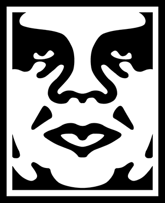
Here's the article on Shepard Fairey for you to read & respond to:
Obey Plagiarist Shepard Fairey, by Mark Vallen
Please answer the following questions, and print out your answers to hand in on Tuesday's class:
1. Vallen suggests Fairey has no demonstrable drawing ability, calling his art "machine art that any second-rate art student could produce." Is this an accurate appraisal of Fairey's style? Is it a relevant critique? Explain why or why not, in each case.
2. Vallen suggests that Lichtenstein's appropriation of comic strip imagery is valid, while Fairey's is not. What is the distinction he draws between the two artists? And do you think it's a valid distinction?
3. Vallen claims that the rationale behind Fairey's "Obey Giant" campaign -- to "stimulate curiosity and bring people to question both the campaign and their relationship with their surroundings - because people are not used to seeing advertisements or propaganda for which the motive is not obvious" -- is "pointless twaddle." Does he have a point, or is this in fact a decent rationale? Why?
4. Did Fairey have any sort of responsibility to recognize the skull image from the "defiant since 89" T-shirt as an SS Skull? Why?
5. Was the use of the Koloman Moser figure for the "Obey Propaganda" poster appropriate? Did Fairey make the image his own, or does it stand too much in the shadow of the original image?
6. Is Fairey's addition of an "Obey" logo to a Black Panther's beret an act of commentary, appropriation, or something else? What does the addition of the "Obey" logo do to transform the meaning of the original image?
7. What do you think Fairey's transformation of Rupert Garcia's "Down with the Whiteness" poster ultimately means?
8. Should Fairey have issued an apology to Rene Mederos, for the use of his poster image on a T-shirt?
9. Do you think that Fairey's use of Gary Grimshaw's winged panther image violates the spirit in which it was created for the "public domain?" Grimshaw says as much: "It is an icon that people can identify with and organize around, and thus must be free of copyright restrictions and onerous ownership. That is the spirit in which the image was created. The commercial exploitation of this image is not strictly criminal because of its public domain intent, but it reeks of the very mean spirit that the image was meant to oppose." Does Grimshaw have a point, or is Fairey completely in the clear in this case?
10. Towards his conclusion, Vallen states: "The expropriation and reuse of images in art has today reached soaring heights, but that relentless mining and distortion of history will turn out to be detrimental for art, leaving it hollowed-out and meaningless in the process. When I refer to "mining" in this case I mean the hasty examination and extraction of information from our collective past as performed by individuals who do not fully comprehend it. That is precisely what Fairey is guilty of, utilizing historic images simply because he "likes" them, and not because he has any grasp of their significance as objects of art or history." Is this a vlid critique of Fairey's art? What responsibility does the artist have to the history and social context of art the imagery he/she chooses to appropriate, if any?


Monday, March 2, 2015
Character Project
For your character design project, due at the start of next class, please have the following:
1. An illustrator file of your character, with a short paragraph of text, explaining:
Character Name
Where character was born
Character personality traits
Character's favorite breakfast food
Character's favorite personal hero
Character's biggest personal enemy
Character's favorite TV show (can be a fictional show)
A phrase the character often says
2. An illustrator file of the character in a different outfit
3. An animated GIF of the character
Wednesday, February 25, 2015
Hydrogen Symbol
Here's a link to a Hydrogen symbol I'll have you download today, as a possible element for the Hydrogen Fuel logo:
https://www.dropbox.com/s/je2pmu7zq95jxez/h2.ai?dl=0
https://www.dropbox.com/s/je2pmu7zq95jxez/h2.ai?dl=0
Monday, February 23, 2015
Names for a Hydrogen Fuel Company
In addition to the poster presentation on wednesday, please come to class with three proposed names for Paul's Hydrogen Fueling Station company. Some of the "concept words" we kicked around were:
Futurefuel
Blue
Bluefleet
Clean
Tech
Energy
Hydro
Water
nextfuel
horizon
nextgen fuels
Futurefuel
Blue
Bluefleet
Clean
Tech
Energy
Hydro
Water
nextfuel
horizon
nextgen fuels
Wednesday, February 18, 2015
Homework for Next Week

This assignment is due at the beginning of class on Wednesday, 2/25.
As a prelude to our poster project, everyone is going to do an in-class presentation on a poster artist or a poster movement, so that we get exposed to a variety of poster styles and approaches. Present images in powerpoint, or as an image slideshow. Everyone will have 10 minutes to present and take questions. In addition to the presentation, you'll need to print out and hand in a minimum three page paper (double-spaced), which will serve as an outline of your presentation. That's three written pages -- not one written page and two pages of pasted-in images. If you want to include images as supplements to the three page paper, feel free. Include a fourth page that lays out your bibliography. If you can get your hands on some actual books to bring to class to show around, please do. There are a few poster art books in Prim Library.
In your presentation and paper, give a description of the artist/movement, and what the social context for the work was. Who was the audience for the posters? What sorts of messages were they trying to convey? Who paid for the posters to be made (if relevant -- some posters, like the May '68 posters, were not commissioned)? What made the posters interesting or unique? What made them stand out? In addition to giving some biographical and social context, pick out several images that interest you, and critique them in some detail. What sorts of formal decisions make the posters "work" (or fail to work, if you think they're bad posters?)
Single out at least two posters, and write about the following elements in each poster:
Describe the qualities of the fonts, and how they are used
Describe the use of color
Describe the use of imagery
Write about the balance between text and image, and the overall composition
Describe the communicative impact of the poster
You could break down the paper in this way:
1 page of personal/cultural background to the artist/movement
1 page dedicated to a specific poster
1 page dedicated to another specific poster
1 bibliography page
Below is a list of poster artists or poster movements to choose from. Plug the name or prase into Google images and pick something that appeals to you visually. Once you've chosen, write your choice in a "comment" to this blog post -- don't pick artists/movements that have already been "claimed" in the comments section (this is first-come, first-serve). You're not restricted to this list -- if you'd like to do a presentation on some other poster artist, just name them in the comments section.
This should go without saying, but don't plagiarize. You'll get caught, and that'll suck.
The Beautiful Angle Poster Project
Art Chantry
Brian Chippendale
Shepard Fairey
Rupert Garcia (chicano movement posters)
Eugène Grasset
Gary Grimshaw (psychedelic 60s posters)
Miss Amy Jo
Judge (judgeworks.com)
Frank Kozik
Strawberry Luna
May 1968 Posters (1968 Paris Uprising, 1968 Street Posters)
Rene Mederos (and Cuban poster artists of the 1960s)
Victor Moscoco
Alphonse Mucha (and Art Nouveau)
Polish movie posters (esp. Jan Lenica)
Print Mafia
Soviet Movie Posters (esp. The Stenberg Brothers)
Soviet propaganda Posters
Théophile Steinlen
Henri de Toulouse-Lautrec
US WW2 propaganda posters
Leonetto Cappiello
Tyler Stout
(The top image is by Bay Area Chicana artist Ester Hernandez)
Thursday, February 5, 2015
Homework for Monday: Character Sketch
On Monday, you'll have some time to finish up your logo design - and we'll also get started on doing a vector character design. This could be a character "mascot" that would accompany your logo - or it could be completely unrelated to your logo. It's possible to go pretty simple for this one, if you're intimidated by the idea of drawing something (the Yeti, below, is made up of pretty basic shapes). Your homework is to come to class with a sketch of your character. As with the logo project, I expect you to have an idea for the psychological properties of this character, and some ideas on how those qualities are reflected in design choices you made for the character.
If you're looking for ideas/inspiration, check out these links:
http://design.tutsplus.com/tutorials/creating-a-simple-kawaii-yeti-with-basic-shapes-in-adobe-illustrator--vector-10738
http://www.ryancoxusa.com
http://naldzgraphics.net/inspirations/mercedes-cerspo-yemayema-character-design/
http://www.creativebloq.com/character-design/10-tips-kawaii-character-design-514833
http://bongangart.com/78658/1234741/art/yuck
http://design.tutsplus.com/tutorials/how-to-create-a-stinking-zombie-flesh-eater-in-illustrator--vector-2246
Wednesday, February 4, 2015
Geico 2015 Super Bowl Ad
I think this ad falls under interesting characters, and also (kinda) people you'd like to associate with. The interesting characters are funny, but the old man is also telling you how cool he is and how successful he is. He's telling you how much you want to be like him because of all his cool stuff. It might be also a testimonial of a lifestyle, he has all that swag because of calling geico and saving on his car insurance. I think it was effective towards both young & middle aged people (it's audience), because it was actually very funny.
Tuesday, February 3, 2015
Super bowl Commercial
Monday, February 2, 2015
This Super Bowl commercial falls into the fourth format of advertisement, comparison.
Sprint its telling us that Verizon and AT&T are expensive. Sprint is advertising an event to cut the price in half for new customers coming from both Verizon and AT&T when you turn in your old phone. I believe this is an effective add because it was simple and funny with a good pun. This was the most memorable ad. for me throughout the game.
Superbowl Ad assignment
SUPERBOWL AD ASSIGNMENT
For next class, I'd like you to read/review a couple of articles about "the 12 Types of Advertisement" – as classified by creative director Donald Gunn, way back in 1978.
Here's a six-minute video about the 12 types:
http://www.mediabistro.com/unbeige/donald-gunns-12-types-of-tv-advertising_b3604
And here's a transcript of that video, just for easier textual reference - it has some example ads embedded, although unfortunately a good chunk of the embed are no longer working (the ads are excerpted in the above video, anyway):
http://adsoftheworld.com/blog/ivan/2007/jul/24/12_kinds_of_advertisements
I want you to pick out one of this weekend's superbowl ads (you can google "superbowl ads" or see a selection here), embed it on this blog, and write which of the 12 ad types you think it is, giving supporting examples for your classification. Also, write whether you think it's an effective ad or not – and give your reasons. Please check in on this blog to see if the ad you're picking has already been taken.
For instructions on how to embed a youtube video on blogger, click here.
Tuesday, January 27, 2015
Vans Logo
This is the Vans logo, Vans is a manufacturer of shoes and apparel. The brand is very active in the action sports community and is involved with various skateboard, snowboard, motocross, bmx, and surf teams. The skateboard resembles their roots, which was skateboarding. The cartoon shape of an old school skateboard is very fitting. The bright color red stands out and is bright and loud. Their slogan "Off The Wall" was a saying that the skaters back in the mid 70's used to say when riding pools. "They were coming Off The Wall".
Monday, January 26, 2015
Needles and Pens logo

Logo Post

Earth Balance is a food company that I believe has a very strong logo. Aesthetically, the logo is very simple with a perfect combination of rhythm/motion (the plant) and structure (the words). The colors chosen are of darker hues making it apart of the "earthy" color scheme. The green and brown work very nicely together because the brown has a more slightly noticeable amount of red mixed in (than just normal brown) which accentuates the green even more. The font is elegant yet formal, which is always nice because it doesn't overwhelm the viewer. Earth Balance's logo is simple and classy resulting in my personal approval for the logo itself.
Sunday, January 25, 2015
Logo post
This is the logo for my favorite snowboard company Gnarly. Its a black and white logo which is simple and easy to look at, plus black goes with everything. The logo uses a very playful font, this is fitting because as a company they are also playful. The logo itself represents a tree in the form of a peace sign, giving the company a down to earth feel that a lot of people can relate to. As far as the name goes, the word gnarly is a pretty commonly used word in the action sports community anyway so I think it works.
Wednesday, January 21, 2015
Sunday, January 18, 2015
Spring 2015: Welcome
Welcome to the Blog for the Intermediate Digital Darkroom class: Art & Advertising.
For the next Monday's class (1/26), I want you to have ready, at the beginning of class, three things – a printed out reading response, a blog post, and sketches for a logo you will design. See below for details.
2. BLOG POST: Create a blog post, on this blog, about a logo design you think is particularly good. Include an image of the logo. In the blog post, answer the question: why do you think this logo is a good design? Be sure to touch on at least these three areas:
a) color
b) font
c) imagery (if imagery is used)
Explain the emotional or psychological qualities that are conveyed by the formal choices in these areas. For example, if the font uses a bright, vibrant color, is it being used to convey a sense of excitement? Energy? What are the company's qualities that are being cued by the formal choices?
3. LOGO DESIGN SKETCHES: Our first project in this class will be to design a logo – we'll use Adobe Illustrator to execute the design. I'm going to have you design multiple alternate designs for your logo, but to start off, for Monday's class, I just want you to hand in one sketch of your logo (it can be pencil, or a digital "sketch" – or anything in between). This can be a logo for yourself – if you were somehow promoting yourself. Or it can be a logo for an actual company you'd like to start – or a logo for an entirely fictional company (if it's a fictional company, you'll have to be able to explain what sort of fictional company it is – a tech company, a movie studio, a sports drink company – whatever it might be).
And here's a link to "Merchants of Cool," if you ever want to revisit it, or dig info some further research/supporting materials on it:
http://www.pbs.org/wgbh/pages/frontline/shows/cool/
Lastly, you can download the syllabus here:
Intermediate Digital Darkroom:
https://www.dropbox.com/s/qdhypzdck5e4q66/15SpringDART330-1Lanier.doc?dl=0
Advanced Digital Darkroom:
https://www.dropbox.com/s/nvuvmzjsz2ft1ma/15SpringDART430-1Lanier.doc?dl=0
For the next Monday's class (1/26), I want you to have ready, at the beginning of class, three things – a printed out reading response, a blog post, and sketches for a logo you will design. See below for details.
1. READING RESPONSE: After having read the three articles posted below, type out and print a page of answers to the following questions:
In response to the Obama 'O' logo article: Why were the designers so concerned about having standards and consistency around the reproductions of the logo? What would the dangers have been if the logo seemed too "branded" or "slick"? Make a list of the specific qualities or emotions you think the logo evokes (or intends to evoke), and pair each quality with a design element (for example, one emotion it intends to evoke is "patriotism," and it does this by incorporating the colors red, white, and blue).
In response to the Pepsi articles: Do you agree with the designer that the new logo "brings humanity back" to the Pepsi? What do you think he means by that? What design choices were made to make the logo seem more "adventurous" and "youthful"? Do you think the design succeeds in those categories? What are the emotional qualities of the new font choice? Why is changing a logo so costly?
Here are the articles:
That last post is on a site, logodesignlove, that has some terrific resources, for example:
2. BLOG POST: Create a blog post, on this blog, about a logo design you think is particularly good. Include an image of the logo. In the blog post, answer the question: why do you think this logo is a good design? Be sure to touch on at least these three areas:
a) color
b) font
c) imagery (if imagery is used)
Explain the emotional or psychological qualities that are conveyed by the formal choices in these areas. For example, if the font uses a bright, vibrant color, is it being used to convey a sense of excitement? Energy? What are the company's qualities that are being cued by the formal choices?
3. LOGO DESIGN SKETCHES: Our first project in this class will be to design a logo – we'll use Adobe Illustrator to execute the design. I'm going to have you design multiple alternate designs for your logo, but to start off, for Monday's class, I just want you to hand in one sketch of your logo (it can be pencil, or a digital "sketch" – or anything in between). This can be a logo for yourself – if you were somehow promoting yourself. Or it can be a logo for an actual company you'd like to start – or a logo for an entirely fictional company (if it's a fictional company, you'll have to be able to explain what sort of fictional company it is – a tech company, a movie studio, a sports drink company – whatever it might be).
And here's a link to "Merchants of Cool," if you ever want to revisit it, or dig info some further research/supporting materials on it:
http://www.pbs.org/wgbh/pages/frontline/shows/cool/
Lastly, you can download the syllabus here:
Intermediate Digital Darkroom:
https://www.dropbox.com/s/qdhypzdck5e4q66/15SpringDART330-1Lanier.doc?dl=0
Advanced Digital Darkroom:
https://www.dropbox.com/s/nvuvmzjsz2ft1ma/15SpringDART430-1Lanier.doc?dl=0
Subscribe to:
Posts (Atom)