This is the Vans logo, Vans is a manufacturer of shoes and apparel. The brand is very active in the action sports community and is involved with various skateboard, snowboard, motocross, bmx, and surf teams. The skateboard resembles their roots, which was skateboarding. The cartoon shape of an old school skateboard is very fitting. The bright color red stands out and is bright and loud. Their slogan "Off The Wall" was a saying that the skaters back in the mid 70's used to say when riding pools. "They were coming Off The Wall".
Tuesday, January 27, 2015
Vans Logo
This is the Vans logo, Vans is a manufacturer of shoes and apparel. The brand is very active in the action sports community and is involved with various skateboard, snowboard, motocross, bmx, and surf teams. The skateboard resembles their roots, which was skateboarding. The cartoon shape of an old school skateboard is very fitting. The bright color red stands out and is bright and loud. Their slogan "Off The Wall" was a saying that the skaters back in the mid 70's used to say when riding pools. "They were coming Off The Wall".
Monday, January 26, 2015
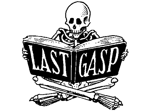
Needles and Pens logo

Logo Post

Earth Balance is a food company that I believe has a very strong logo. Aesthetically, the logo is very simple with a perfect combination of rhythm/motion (the plant) and structure (the words). The colors chosen are of darker hues making it apart of the "earthy" color scheme. The green and brown work very nicely together because the brown has a more slightly noticeable amount of red mixed in (than just normal brown) which accentuates the green even more. The font is elegant yet formal, which is always nice because it doesn't overwhelm the viewer. Earth Balance's logo is simple and classy resulting in my personal approval for the logo itself.
Sunday, January 25, 2015
Logo post
This is the logo for my favorite snowboard company Gnarly. Its a black and white logo which is simple and easy to look at, plus black goes with everything. The logo uses a very playful font, this is fitting because as a company they are also playful. The logo itself represents a tree in the form of a peace sign, giving the company a down to earth feel that a lot of people can relate to. As far as the name goes, the word gnarly is a pretty commonly used word in the action sports community anyway so I think it works.
Wednesday, January 21, 2015
Sunday, January 18, 2015
Spring 2015: Welcome
Welcome to the Blog for the Intermediate Digital Darkroom class: Art & Advertising.
For the next Monday's class (1/26), I want you to have ready, at the beginning of class, three things – a printed out reading response, a blog post, and sketches for a logo you will design. See below for details.
2. BLOG POST: Create a blog post, on this blog, about a logo design you think is particularly good. Include an image of the logo. In the blog post, answer the question: why do you think this logo is a good design? Be sure to touch on at least these three areas:
a) color
b) font
c) imagery (if imagery is used)
Explain the emotional or psychological qualities that are conveyed by the formal choices in these areas. For example, if the font uses a bright, vibrant color, is it being used to convey a sense of excitement? Energy? What are the company's qualities that are being cued by the formal choices?
3. LOGO DESIGN SKETCHES: Our first project in this class will be to design a logo – we'll use Adobe Illustrator to execute the design. I'm going to have you design multiple alternate designs for your logo, but to start off, for Monday's class, I just want you to hand in one sketch of your logo (it can be pencil, or a digital "sketch" – or anything in between). This can be a logo for yourself – if you were somehow promoting yourself. Or it can be a logo for an actual company you'd like to start – or a logo for an entirely fictional company (if it's a fictional company, you'll have to be able to explain what sort of fictional company it is – a tech company, a movie studio, a sports drink company – whatever it might be).
And here's a link to "Merchants of Cool," if you ever want to revisit it, or dig info some further research/supporting materials on it:
http://www.pbs.org/wgbh/pages/frontline/shows/cool/
Lastly, you can download the syllabus here:
Intermediate Digital Darkroom:
https://www.dropbox.com/s/qdhypzdck5e4q66/15SpringDART330-1Lanier.doc?dl=0
Advanced Digital Darkroom:
https://www.dropbox.com/s/nvuvmzjsz2ft1ma/15SpringDART430-1Lanier.doc?dl=0
For the next Monday's class (1/26), I want you to have ready, at the beginning of class, three things – a printed out reading response, a blog post, and sketches for a logo you will design. See below for details.
1. READING RESPONSE: After having read the three articles posted below, type out and print a page of answers to the following questions:
In response to the Obama 'O' logo article: Why were the designers so concerned about having standards and consistency around the reproductions of the logo? What would the dangers have been if the logo seemed too "branded" or "slick"? Make a list of the specific qualities or emotions you think the logo evokes (or intends to evoke), and pair each quality with a design element (for example, one emotion it intends to evoke is "patriotism," and it does this by incorporating the colors red, white, and blue).
In response to the Pepsi articles: Do you agree with the designer that the new logo "brings humanity back" to the Pepsi? What do you think he means by that? What design choices were made to make the logo seem more "adventurous" and "youthful"? Do you think the design succeeds in those categories? What are the emotional qualities of the new font choice? Why is changing a logo so costly?
Here are the articles:
That last post is on a site, logodesignlove, that has some terrific resources, for example:
2. BLOG POST: Create a blog post, on this blog, about a logo design you think is particularly good. Include an image of the logo. In the blog post, answer the question: why do you think this logo is a good design? Be sure to touch on at least these three areas:
a) color
b) font
c) imagery (if imagery is used)
Explain the emotional or psychological qualities that are conveyed by the formal choices in these areas. For example, if the font uses a bright, vibrant color, is it being used to convey a sense of excitement? Energy? What are the company's qualities that are being cued by the formal choices?
3. LOGO DESIGN SKETCHES: Our first project in this class will be to design a logo – we'll use Adobe Illustrator to execute the design. I'm going to have you design multiple alternate designs for your logo, but to start off, for Monday's class, I just want you to hand in one sketch of your logo (it can be pencil, or a digital "sketch" – or anything in between). This can be a logo for yourself – if you were somehow promoting yourself. Or it can be a logo for an actual company you'd like to start – or a logo for an entirely fictional company (if it's a fictional company, you'll have to be able to explain what sort of fictional company it is – a tech company, a movie studio, a sports drink company – whatever it might be).
And here's a link to "Merchants of Cool," if you ever want to revisit it, or dig info some further research/supporting materials on it:
http://www.pbs.org/wgbh/pages/frontline/shows/cool/
Lastly, you can download the syllabus here:
Intermediate Digital Darkroom:
https://www.dropbox.com/s/qdhypzdck5e4q66/15SpringDART330-1Lanier.doc?dl=0
Advanced Digital Darkroom:
https://www.dropbox.com/s/nvuvmzjsz2ft1ma/15SpringDART430-1Lanier.doc?dl=0
Subscribe to:
Comments (Atom)