Our final is this Friday (May 6th), 11:30am-2:30pm, in our usual classroom.
Please bring any additional projects you didn't have available to burn in today's class. If you're missing any files, include a word doc describing the missing projects.
Here's the list of projects for the semester:
1. Logo design
2. Business competition powerpoint support
3. Sierra Nevada Review cover design
4. Poster design
5. "Found footage" video edit
6. Infographic
7. From Dictatorship to Democracy: Violent Resistance Image
8. From Dictatorship to Democracy: Image for pdf booklet
Tuesday, May 3, 2011
Tuesday, April 26, 2011
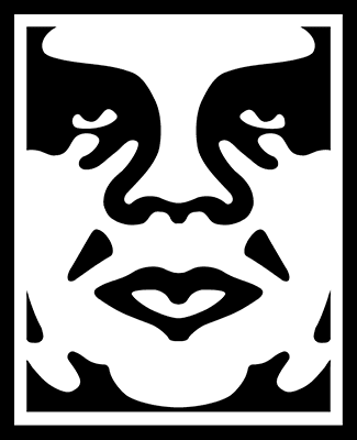
Black & White & Negative Space

Here's the "stencil-style" illustration that uses black and white in a dynamic way -- in a more dynamic way than using a simple silhouette. Use the visual logic of this image -- defining the form with combinations of black and white.
Thursday, April 21, 2011
DICTATORSHIP TO DEMOCRACY: Who's doing what
For the beginning of Tuesday's class, I want to see three worked-out sketches (three alternate versions) working out your visualization from the section of "From Dictatorship to Democracy" that you've been assigned. I want you to have at least three versions so you don't just get stuck on one visual idea -- and also, on Tuesday, when we look at all of your sketches, I'm hoping we might be able to cross-pollinate some of the visual ideas. I can see one concept being applicable to another concept, or perhaps there are "characters" for figures such as the dictator, the resister, etc., that could be applied across several of the ideas.
Here's the list of the sections (by number, corresponding to the numbering on the previous blog post), and who's doing what:
1: Brett
2. Jessica
3. Ethan B.
4. Ethan R.
5. E'Sha
6. Lane
7. Michele
8. Jasen
9. Keith
10. Trevor
11. Victor
12. Michael
Here's the list of the sections (by number, corresponding to the numbering on the previous blog post), and who's doing what:
1: Brett
2. Jessica
3. Ethan B.
4. Ethan R.
5. E'Sha
6. Lane
7. Michele
8. Jasen
9. Keith
10. Trevor
11. Victor
12. Michael
References for "From Dictatorship to Democracy"
FROM DICTATORSHIP TO DEMOCRACY
by Gene Sharp
Link to pdf here (with helpful appendices)
Concepts and excerpts
1. THE FOUR TASKS
When one wants to bring down a
dictatorship most effectively and with the least cost then one has
four immediate tasks:
• One must strengthen the oppressed population themselves
in their determination, self-confidence, and resistance skills;
• One must strengthen the independent social groups and institutions
of the oppressed people;
• One must create a powerful internal resistance force; and
• One must develop a wise grand strategic plan for liberation
and implement it skillfully.
2. THE "MONKEY MASTER" METAPHOR
A Fourteenth Century Chinese parable by Liu-Ji:
In the feudal state of Chu an old man survived by keeping
monkeys in his service. The people of Chu called him “ju
gong” (monkey master).
Each morning, the old man would assemble the monkeys
in his courtyard, and order the eldest one to lead the others
to the mountains to gather fruits from bushes and trees.
It was the rule that each monkey had to give one-tenth of
his collection to the old man. Those who failed to do so
would be ruthlessly flogged. All the monkeys suffered
bitterly, but dared not complain.
One day, a small monkey asked the other monkeys: “Did
the old man plant all the fruit trees and bushes?” The others
said: “No, they grew naturally.” The small monkey
further asked: “Can’t we take the fruits without the old
man’s permission?” The others replied: “Yes, we all can.”
The small monkey continued: “Then, why should we depend
on the old man; why must we all serve him?”
Before the small monkey was able to finish his statement,
all the monkeys suddenly became enlightened and awakened.
On the same night, watching that the old man had fallen
asleep, the monkeys tore down all the barricades of the
stockade in which they were confined, and destroyed the
stockade entirely. They also took the fruits the old man had
in storage, brought all with them to the woods, and never
returned. The old man finally died of starvation.
Yu-li-zi says, “Some men in the world rule their people by
tricks and not by righteous principles. Aren’t they just like
the monkey master? They are not aware of their muddleheadedness.
As soon as their people become enlightened,
their tricks no longer work.”
3. THE LESSON OF THE "MONKEY MASTER" FABLE:
Dictators require the assistance of the people
they rule, without which they cannot secure and maintain the sources
of political power.
4. DICTATORS' SOURCES OF POWER
• Authority, the belief among the people that the regime is legitimate,
and that they have a moral duty to obey it;
• Human resources, the number and importance of the persons
and groups which are obeying, cooperating, or providing
assistance to the rulers;
• Skills and knowledge, needed by the regime to perform specific
actions and supplied by the cooperating persons and
groups;
• Intangible factors, psychological and ideological factors that
may induce people to obey and assist the rulers;
• Material resources, the degree to which the rulers control or
have access to property, natural resources, financial resources,
the economic system, and means of communication and
transportation; and
• Sanctions, punishments, threatened or applied, against the
disobedient and noncooperative to ensure the submission
and cooperation that are needed for the regime to exist and
carry out its policies.
If these sources of power can be severed, the dictator's power will be weakened.
5A. SEVERING POWER SOURCES: AUTHORITY
Acts of symbolic repudiation and defiance are among the available
means to undermine the regime’s moral and political authority
— its legitimacy. The greater the regime’s authority, the greater
and more reliable is the obedience and cooperation which it will
receive. Moral disapproval needs to be expressed in action in order
to seriously threaten the existence of the dictatorship. Withdrawal
of cooperation and obedience are needed to sever the availability of
other sources of the regime’s power.
Acts of symbolic repudiation and defiance
5B. SEVERING POWER SOURCES: HUMAN RESOURCES
A second important such source of power is human resources,
the number and importance of the persons and groups that obey,
cooperate with, or assist the rulers. If noncooperation is practiced by
large parts of the population, the regime will be in serious trouble.
For example, if the civil servants no longer function with their normal
efficiency or even stay at home, the administrative apparatus will
be gravely affected.
noncooperation
5C. SEVERING POWER SOURCES: SKILLS AND KNOWLEDGE
Similarly, if the noncooperating persons and groups include
those that have previously supplied specialized skills and knowledge,
then the dictators will see their capacity to implement their
will gravely weakened. Even their ability to make well-informed
decisions and develop effective policies may be seriously reduced.
noncooperation of skilled persons
5D. SEVERING POWER SOURCES: INTANGIBLE FACTORS
If psychological and ideological influences — called intangible
factors — that usually induce people to obey and assist the rulers
are weakened or reversed, the population will be more inclined to
disobey and to noncooperate.
reversal of psychological and ideological influences
5E. SEVERING POWER SOURCES: MATERIAL RESOURCES
The dictators’ access to material resources also directly affects
their power. With control of financial resources, the economic
system, property, natural resources, transportation, and means of
communication in the hands of actual or potential opponents of
the regime, another major source of their power is vulnerable or removed.
Strikes, boycotts, and increasing autonomy in the economy,
communications, and transportation will weaken the regime.
strikes, boycotts, autonomy in economy, communications, transportation
5F. SEVERING POWER SOURCES: SANCTIONS
As previously discussed, the dictators’ ability to threaten or
apply sanctions — punishments against the restive, disobedient, and
noncooperative sections of the population — is a central source of
the power of dictators. This source of power can be weakened in
two ways. First, if the population is prepared, as in a war, to risk
serious consequences as the price of defiance, the effectiveness of the
available sanctions will be drastically reduced (that is, the dictators’
repression will not secure the desired submission). Second, if the
police and the military forces themselves become disaffected, they
may on an individual or mass basis evade or outright defy orders to
arrest, beat, or shoot resisters. If the dictators can no longer rely on
the police and military forces to carry out repression, the dictatorship
is gravely threatened.
resistance and subversion of army and police support
6. SOURCES OF DEMOCRATIC ORGANIZATION
One characteristic of a democratic society is that there exist independent
of the state a multitude of nongovernmental groups and institutions. These include, for example, families, religious organizations,
cultural associations, sports clubs, economic institutions, trade
unions, student associations, political parties, villages, neighborhood
associations, gardening clubs, human rights organizations, musical
groups, literary societies, and others. These bodies are important
in serving their own objectives and also in helping to meet social
needs.
7. DEMOCRATIC POWER AS AN ALTERNATIVE TO STATE POWER
Combined with political defiance during the phase of selective resistance,
the growth of autonomous social, economic, cultural, and
political institutions progressively expands the “democratic space”
of the society and shrinks the control of the dictatorship. As the civil
institutions of the society become stronger vis-à-vis the dictatorship,
then, whatever the dictators may wish, the population is incrementally
building an independent society outside of their control.
8. CATEGORIES OF NONVIOLENT ACTION: PROTEST AND PERSUASION
Methods of nonviolent protest
and persuasion are largely symbolic demonstrations, including parades,
marches, and vigils (54 methods).
9. CATEGORIES OF NONVIOLENT ACTION: NON-COOPERATION
Noncooperation is divided
into three sub-categories: (a) social noncooperation (16 methods),
(b) economic noncooperation, including boycotts (26 methods) and
strikes (23 methods), and (c) political noncooperation (38 methods).
10. CATEGORIES OF NONVIOLENT ACTION: INTERVENTION
Nonviolent intervention, by psychological, physical, social, economic,
or political means, such as the fast, nonviolent occupation, and
parallel government (41 methods)
11. THE NEED FOR STRATEGIC PLANNING
A plan to achieve that
objective will usually consist of a phased series of campaigns and
other organized activities designed to strengthen the oppressed
population and society and to weaken the dictatorship. Note here
that the objective is not simply to destroy the current dictatorship
but to emplace a democratic system. A grand strategy that limits
its objective to merely destroying the incumbent dictatorship runs
a great risk of producing another tyrant.
12. DRAFTING OF CONSTITUTION
The new democratic system will require a constitution that establishes
the desired framework of the democratic government. The
constitution should set the purposes of government, limits on
governmental powers, the means and timing of elections by which
governmental officials and legislators will be chosen, the inherent
rights of the people, and the relation of the national government to
other lower levels of government.
Thursday, April 14, 2011
Assignment for Tuesday (4/19)
Just a recap of what we went over in class:
By the beginning of class Tuesday, you need to have a sketch boiling this idea from "From Dictatorship to Democracy" into a one-page image:
The image should fit onto an 8.5x11" sheet of paper. Some ideas we brainstormed in class were:
small guy with handgun vs. tanks
locals at bottom of image, military forces on top
arm wrestling: one big arm, one scrawny arm
military boot on helpless person
small pile of grenades vs. cruise missile silos
bows & arrow vs. modern weapons
stones/slingshot vs. tank
dictator with foot on deflating globe
By the beginning of class Tuesday, you need to have a sketch boiling this idea from "From Dictatorship to Democracy" into a one-page image:
By placing confidence in violent means, one has chosen the very type of struggle with which the oppressors nearly always have superiority.
The image should fit onto an 8.5x11" sheet of paper. Some ideas we brainstormed in class were:
small guy with handgun vs. tanks
locals at bottom of image, military forces on top
arm wrestling: one big arm, one scrawny arm
military boot on helpless person
small pile of grenades vs. cruise missile silos
bows & arrow vs. modern weapons
stones/slingshot vs. tank
dictator with foot on deflating globe
Band Info for posters
Here's the info to lay into the posters:
Latex Grenade
May 14th, 10pm
Grog n' Grist
800 Tahoe Boulevard
21+ at bar, all ages for general entry
No Cover
FullWatts
Saturdays
Music Starts 9pm
The Grid
8545 North Lake Blvd
Kings Beach, CA
No Cover
21 & Over
Latex Grenade
May 14th, 10pm
Grog n' Grist
800 Tahoe Boulevard
21+ at bar, all ages for general entry
No Cover
FullWatts
Saturdays
Music Starts 9pm
The Grid
8545 North Lake Blvd
Kings Beach, CA
No Cover
21 & Over
Monday, April 4, 2011
Appropriated Footage, & Infographics Assignment
This Tuesday, we'll look at your completed "appropriated footage" project. Next up, we'll be doing a project based on Infographics.
By Thursday's class, I want you to have chosen what data you are going to turn into an infographic. Your treatment of the graphic can be whimsical, but the data must be real. The data can be useless and ridiculous -- it can be data that you yourself generate (for example, how many calories you consume in an average day could be data), but it must be real. Come prepared with a sketch suggesting your idea for visualizing your data.
Some infographics sites we'll dip into
Edward Tufte:
http://www.edwardtufte.com/tufte/
http://www.edwardtufte.com/tufte/fineart
Visual Complexity:
http://www.visualcomplexity.com/vc/
The Infographics Blog:
http://www.infographicsblog.com/
GOOD Transparencies flickr archive:
http://www.flickr.com/photos/goodmagazine/sets/72157618896371005/
Datavisualization.ch:
http://www.datavisualization.ch/
Information Aesthetics:
http://infosthetics.com/
Chad Hagen's Nonsense Infographics:
http://www.chadhagen.com/#56490/Nonsensical-Infographics
Places and Spaces (look at Ward Shelley's "History of Science Fiction"):
http://scimaps.org/submissions/7-digital_libraries/10maps+quotes.html
The Sequel Map:
http://boxofficequant.com/wp-content/uploads/2011/01/Sequel-Map-1-4.png
Mega Shark infographic:
http://staubman.com/blog/?p=67
"Phase Anatomy":
http://hilobrow.com/2011/04/04/phase-anatomy/
Satellite Photos of Japan, before and after the quake:
http://www.nytimes.com/interactive/2011/03/13/world/asia/satellite-photos-japan-before-and-after-tsunami.html
RSA Animate: Drive
Toxie's Dead: Planet Money
Tuesday, March 29, 2011
Another public domain resource
Via Keith, the Cinema Snob's "Public Domain Theater":
http://thecinemasnob.com/categories/Public%20Domain%20Theater.aspx
http://thecinemasnob.com/categories/Public%20Domain%20Theater.aspx
Thursday, March 24, 2011
Re-editing examples
Here are the full clips of the examples I showed in class, showing how the meaning of a clip can be changed through formal operations (rather than more narrative operations):
Martin Arnold's take on "To Kill a Mockingbird":
http://www.youtube.com/watch?v=drDPbKquQVw
A summary of some strategies to change the meaning of the original clips:
Changing the audio -- either by using a different audio source, or by recording your own narration (which is obviously a very controlled way to shape the meaning of a clip).
Juxtaposing sources -- placing shots in different contexts so that they come together to tell a new story. People from one clip can be made to react to events happening in an entirely different clip. A shot of someone smiling, followed by a shot of a happy baby, has a very different effect than the same shot of someone smiling, followed by a shot of a murdered corpse.
Use of text -- the longer film we watched, "Phantom Limb," told the story of the filmmaker's relationship to his younger brother through text inserts.
An effective strategy can be to give objects and characters in a shot a different symbolic meaning than was originally intended. Think of the shots of the collapsing buildings in "Phantom Limb" -- because of the context that was laid out for the viewer, those buildings were stand-ins for the collapsing family, almost as if the building were actors, acting out that part of the story. Giving something a symbolic of a metaphorical dimension is a way to have objects or scenes operate on a level that might not be present in the original footage.
Final Cut Info and References
Some online tutorials that cover the same ground:
Setting your scratch disk
http://www.youtube.com/watch?v=8F-yajkhcqI
Basic FCP intro:
http://www.calstatela.edu/tvf/fcptutorial.html
Text in FCP (sorry for the ad):
http://www.metacafe.com/watch/883172/adding_text_with_final_cut_pro/
FINAL CUT PRO INTRO
SETTING YOUR SCRATCH DISK:
Set your scratch disk by clicking:
Final Cut Pro > System settings
Under the "Scratch Disks" tab, set the location for your content. Make sure to set it to Thawspace if you're not setting it to an external drive.
STARTING A NEW PROJECT:
Go to:
File > New Project
Then go to:
Final Cut Pro > Audio/Video Settings
Set this project at:
DV NTSC 48 kHz
Then go to:
Final Cut Pro > Easy Setup
And under Format select DV NTSC
BASIC TRANSITIONS:
NOTE: You can use the arrow keys to toggle forward/backward one frame at a time.
Move your playhead to the place where two clips join up on the timeline. Then go to:
Effects > Video Transitions to choose the type of transition you'd like.
If the playhead is between the two clips, it will create the transition right at that point. If you select a whole clip, it will apply the transition to both ends of the clip. Once the transition has been created, you can doubleclick on the transition in the timeline, and adjust the duration (the parameters will appear in the "Viewer" window).
ALTERNATE TRANSITIONS AND EFFECTS FOR MULTIPLE VIDEO TRACKS:
You can also drag a new video track above the current video track. You can edit the opacity of the uppermost track by clicking on the "Toggle Clip Overlays" button at the bottom left of the timeline (it looks like a zigzag line). Once that button is clicked, you can use the pen tool (the last tool in the toolbar) to click on the line that appears at the top of your clips, and create point that can be dragged down or up to adjust the opacity of the clip at any point of its duration.
You can also composite two layers together, with a variety of effects similar to the layer effects in Photoshop, by right-clicking on the upper video layer, and selecting "Composite Mode" from the popup menu -- from there, you can choose from the listed composite effects.
VIDEO EFFECTS FOR A SINGLE VIDEO TRACK
There are a variety of video effects you can apply to a clip by selecting the clip, then going to Effects > Video Filters.
DE-LINKING AN IMPORTED VIDEO AND AUDIO TRACK
If you import a video clip, and the audio track is linked, when you move the video track along the timeline, the audio track will move along with it. To de-link the audio track, hit shift + L (or hit the "linked selection" button, the middle button to the top right of the timeline window). Then you can move, edit, delete or replace the audio track.
TEXT IN FCP:
In your "Browser" window, click on the "Effects" tab. Go to:
Video generators > Text
From which you can select a variety of text options. You can drag one of those text options into your timeline, where it will function like a video clip. Doubleclicking on the text clip on the timeline will open a dialog box in your viewer, from which you can type the text, select the font, size, etc. (click the "controls" tab in the viewer to access these parameters). You can adjust the duration and motion properties of the clip as well.
Wednesday, March 9, 2011
Footage Remixes
For reference for Thursday's class:
The Prelinger Archive:
http://www.archive.org/details/prelinger
Prelinger Television Commercials
Prelinger Tag Cloud
Rose Hobart:
http://www.youtube.com/watch?v=XnbbqiD7C7A&tracker=False
http://www.youtube.com/watch?v=lQVLLGzhLl0&tracker=False
Slap Chop rap:
Day Job Orchestra:
Everything Is Terrible:
CREEPS N' SEX OBJECTS 4 KIDZ! from Everything Is Terrible! on Vimeo.
THE MAJESTY OF CHRISTMAS MUSIC from Everything Is Terrible! on Vimeo.
Thursday, March 3, 2011
Changing color spaces
The best steps for getting a more accurate conversion from spot color to CMYK color space:
Save your spot color version, so that at some point you could potentially return to your two-color separations. Also make sure you save a version with editable text, since we'll need to update the venue/date info.
Then do a "Save As," saving out the version you're dong to be moving into CMYK color space. There is usually a closer fidelity to your spot colors if you first move the file into RGB color space. So go to:
Image > Mode > RGB color
Then, shift-select your two spot channels, and in the button to the top right of the channels window, select "Merge Spot Channels." This will redistribute your colors into the RGB color space.
Once that's accomplished go to:
Image > Mode > CMYK
This will move everything into CMYK color space -- a typical print format. here might be a bit of shift in the color tones, since CMYK color is limited in its saturations and values. But running it through the RGB color space tends to preserve more of the original color tones than merging directly from spot color mode to CMYK mode.
Wednesday, March 2, 2011
Finished Poster & Response Paper, due on Tuesday
At the beginning of next Tuesday's class, your finished poster design is due. Also, I want you to write a series of short responses to some questions, in reaction to an online reading assignment.
Here's the article on Shepard Fairey for you to read & respond to:
Obey Plagiarist Shepard Fairey, by Mark Vallen
Please answer the following questions, and send them in an email to my school email account before Wednesday's class:
1. Vallen suggests Fairey has no demonstrable drawing ability, calling his art "machine art that any second-rate art student could produce." Is this an accurate appraisal of Fairey's style? Is it a relevant critique? Explain why or why not, in each case.
2. Vallen suggests that Lichtenstein's appropriation of comic strip imagery is valid, while Fairey's is not. What is the distinction he draws between the two artists? And do you think it's a valid distinction?
3. Vallen claims that the rationale behind Fairey's "Obey Giant" campaign -- to "stimulate curiosity and bring people to question both the campaign and their relationship with their surroundings - because people are not used to seeing advertisements or propaganda for which the motive is not obvious" -- is "pointless twaddle." Does he have a point, or is this in fact a decent rationale? Why?
4. Did Fairey have any sort of responsibility to recognize the skull image from the "defiant since 89" T-shirt as an SS Skull? Why?
5. Was the use of the Koloman Moser figure for the "Obey Propaganda" poster appropriate? Did Fairey make the image his own, or does it stand too much in the shadow of the original image?
6. Is Fairey's addition of an "Obey" logo to a Black Panther's beret an act of commentary, appropriation, or something else? What does the addition of the "Obey" logo do to transform the meaning of the original image?
7. What do you think Fairey's transformation of Rupert Garcia's "Down with the Whiteness" poster ultimately means?
8. Should Fairey have issued an apology to Rene Mederos, for the use of his poster image on a T-shirt?
9. Do you think that Fairey's use of Gary Grimshaw's winged panther image violates the spirit in which it was created for the "public domain?" Grimshaw says as much: "It is an icon that people can identify with and organize around, and thus must be free of copyright restrictions and onerous ownership. That is the spirit in which the image was created. The commercial exploitation of this image is not strictly criminal because of its public domain intent, but it reeks of the very mean spirit that the image was meant to oppose." Does Grimshaw have a point, or is Fairey completely in the clear in this case?
10. Towards his conclusion, Vallen states: "The expropriation and reuse of images in art has today reached soaring heights, but that relentless mining and distortion of history will turn out to be detrimental for art, leaving it hollowed-out and meaningless in the process. When I refer to "mining" in this case I mean the hasty examination and extraction of information from our collective past as performed by individuals who do not fully comprehend it. That is precisely what Fairey is guilty of, utilizing historic images simply because he "likes" them, and not because he has any grasp of their significance as objects of art or history." Is this a vlid critique of Fairey's art? What responsibility does the artist have to the history and social context of art the imagery he/she chooses to appropriate, if any?
Monday, February 28, 2011
Due Tuesday: a sketch for your poster design
For those who weren't in Thursday's class -- what's due at the beginning of class Tuesday is a sketch for your poster design. Please select one of the bands in the "Band Links" section of this blog (top right) -- listen to some of their tracks, and pick the one whose music gives you the most in the way of visual ideas. This sketch is an assignment unto itself, with its own grade. It doesn't have to be completely worked out, but I don't want you starting Tuesday's class with a totally blank slate -- Tuesday will be a work period for working on the posters. The size format for the posters will be 11"x17".
Also, for those who weren't in Thursday's class, there's one more detail for the poster designs: you're
going to be making a 2-color poster. Of course, by overprinting colors, and by using the white of the paper itself, you can make a 2-color poster look like it has more than two colors -- but you're restricted to two color plates. Here are some examples of 2-color posters:


Monday, February 21, 2011
Movie Posters

I made a post on the SNC/FA art blog, about the art of the movie poster. Check it out for many examples and links.
Thursday, February 10, 2011
Assignment: Poster Artist Presentation

This assignment is due at the beginning of class on Thursday, 2/17.
As a prelude to our poster project, everyone is going to do an in-class presentation on a poster artist or a poster movement, so that we get exposed to a variety of poster styles and approaches. Feel free to present images in powerpoint, or as an image slideshow. Everyone will have 10 minutes to present and take questions. In addition to the presentation, you'll need to email me a minimum three page paper (double-spaced), which will serve as an outline of your presentation. That's three written pages -- not one written page and two pages of pasted-in images. If you want to include images as supplements to the three page paper, feel free. Include a fourth page that lays out your bibliography. If you can get your hands on some actual books to bring to class to show around, please do. There are a few poster art books in Prim Library.
In your presentation and paper, give a description of the artist/movement, and what the social context for the work was. Who was the audience for the posters? What sorts of messages were they trying to convey? Who paid for the posters to be made (if relevant -- some posters, like the May '68 posters, were not commissioned)? What made the posters interesting or unique? What made them stand out? In addition to giving some biographical and social context, pick out several images that interest you, and critique them in some detail. What sorts of formal decisions make the posters "work" (or fail to work, if you think they're bad posters?)
Single out at least two posters, and write about the following elements in each poster:
Describe the qualities of the fonts, and how they are used
Describe the use of color
Describe the use of imagery
Write about the balance between text and image, and the overall composition
Describe the communicative impact of the poster
You could break down the paper in this way:
1 page of personal/cultural background to the artist/movement
1 page dedicated to a specific poster
1 page dedicated to another specific poster
1 bibliography page
Below is a list of poster artists or poster movements to choose from. Plug the name or prase into Google images and pick something that appeals to you visually. Once you've chosen, write your choice in a "comment" to this blog post -- don't pick artists/movements that have already been "claimed" in the comments section (this is first-come, first-serve). You're not restricted to this list -- if you'd like to do a presentation on some other poster artist, just name them in the comments section.
This should go without saying, but don't plagiarize. You'll get caught, and that'll suck.
The Beautiful Angle Poster Project
Art Chantry
Brian Chippendale
Shepard Fairey
Rupert Garcia (chicano movement posters)
Eugène Grasset
Gary Grimshaw (psychedelic 60s posters)
Miss Amy Jo
Judge (judgeworks.com)
Frank Kozik
Strawberry Luna
May 1968 Posters (1968 Paris Uprising, 1968 Street Posters)
Rene Mederos (and Cuban poster artists of the 1960s)
Victor Moscoco
Alphonse Mucha (and Art Nouveau)
Polish movie posters (esp. Jan Lenica)
Print Mafia
Soviet Movie Posters (esp. The Stenberg Brothers)
Soviet propaganda Posters
Théophile Steinlen
Henri de Toulouse-Lautrec
US WW2 propaganda posters
(The top image is by Bay Area Chicana artist Ester Hernandez)
Tuesday, February 1, 2011
Sierra Nevada Review Cover
The text on the cover should read:
Sierra Nevada Review
There should also be the date: 2011
Other than that, it's free reign. Something that somehow references poetry would probably give you a leg up. If you're totally stumped, make a design that's like a rainbow, but not a rainbow.
Here are the two last covers:


Sierra Nevada Review
There should also be the date: 2011
Other than that, it's free reign. Something that somehow references poetry would probably give you a leg up. If you're totally stumped, make a design that's like a rainbow, but not a rainbow.
Here are the two last covers:


Tuesday, January 25, 2011
Logo Assignment
You will each be making a grand total of 9 logo designs for your business competition company. I want you to use three approaches to the logo design, and each of these approaches should have 3 variations (for a total of 9 versions).
The approaches should be as follows:
1. A text-only design (3 different versions, using different fonts or typographical layouts). The text doesn't have to be uniform - you can have some letters larger than others and so on. There should also be some variations in terms of color.
2. A design that integrates the text with an image or abstract symbol (like the swoosh of the Nike logo). Again, I want to see three distinct versions -- using different images or symbols, different type treatments, etc.
3. A design where an image (or abstract shape) is the dominant (and perhaps the only) element of the design. Again, give three distinct versions.
At the bottom of your page, I want you to list the emotional, psychological, or "connotative" qualities you are trying to convey with your design decisions. Separate out the categories of font, color palette, and symbol. An example might be, in the case of a design for a logo for the underwater power generators:
Typeface: no capitals, rounded letterforms -- giving a sense of a small-scale, unintimidating, eco-friendly company.
Color palette: the use of blue connects to the idea of hydro-power, while the use of yellow is meant to convey energy, and electricity.
Symbols: The shape is meant to reference the shape of a wave, since the power is coming from a water source.
You may have to list out different properties for different designs, if your designs go aggressively in different directions.
Thursday, January 20, 2011


Wednesday, January 19, 2011
Jessica's Logo: NASA
This is the logo for the National Aeronautics and Space Administration. I chose this logo because I like how clearly it communicates the point. The stars represent outer space, and the white circle around the lettering looks like a comet or an orbiting satellite. The red shape is a wing representing aeronautics (until I looked it up, I thought it was a flame or just a shape implying movement).

My Logo

This is my logo of choice. It is the Thundercats logo. The color scheme is simplistic but pops a dramatic/epic bold image of some feline creature. This logo depicts a theme to me feels honorable, courage able, and inspirational in nature.
Tuesday, January 18, 2011
logo lane likes
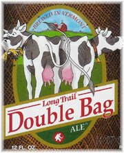 This is a Logo I like
Being from the great state of New Hampshire, I love to sample lots of local brews, and loving beer. I have found that Vermont is one of the best states in the US for beer. I love the unique taste of varieties of dark beers. This beer is called double bag because it has double the malts, hopps, etc. They did a great job of displaying two bags with the cows. The white colors make the red really poppy, dragging one to the center, with the red barn at the top. The font is super basic, keeping it simple is keeping it good. If it was more complicated it may take away from the image. The background color thatch really help bring one to the middle also. This is the best beer invented to man.

Monday, January 17, 2011
Welcome for 2011, and the first assignment
Welcome to the Blog for the Intermediate Digital darkroom class: Art & Advertising.
For the next class (Thurs), I want you to have ready, at the beginning of class, two things:
1. Create a blog post, on this blog, about a logo design you think is particularly good. Include an image of the logo. Be prepared to answer the question: why do you think this logo is a good design? Be sure to touch on at least these three areas:
a) color
b) font
c) imagery (if imagery is used)
Explain the emotional or psychological qualities that are conveyed by the formal choices in these areas. For example, if the font uses a bright, vibrant color, is it being used to convey a sense of excitement? Energy? What are the company's qualities that are being cued by the formal choices?
2. After having read the three articles posted below, type out and print a page of answers to the following questions:
In response to the Obama 'O' logo article: Why were the designers so concerned about having standards and consistency around the reproductions of the logo? What would the dangers have been if the logo seemed too "branded" or "slick"? Make a list of the specific qualities or emotions you think the logo evokes (or intends to evoke), and pair each quality with a design element (for example, one emotion it intends to evoke is "patriotism," and it does this by incorporating the colors red, white, and blue).
In response to the Pepsi articles: Do you agree with the designer that the new logo "brings humanity back" to the Pepsi? What do you think he means by that? What design choices were made to make the logo seem more "adventurous" and "youthful"? Do you think the design succeeds in those categories? What are the emotional qualities of the new font choice? Why is changing a logo so costly?
Here are the articles:
The 'O' in Obama
What went into the Updated Pepsi Logo
Thoughts about Pepsi
That last post is on a site, logodesignlove, that has some terrific resources, for example:
Links to free vector files for logos
A list of logo design resources
And here's a link to "Merchants of Cool," if you ever want to revisit it, or dig info some further research/supporting materials on it:
http://www.pbs.org/wgbh/pages/frontline/shows/cool/
Lastly, you can download the syllabus here:
http://www.box.net/shared/h4dyqkuea6
Subscribe to:
Posts (Atom)