If anyone still has one of those WW2/Vietnam public domain films, please bring them to the museum.
Here's the list of the stuff that should show up on your CD - please bring the burned CD to the museum:
Assignments:
(after midterm)
Video for projection
"Found Footage" Video
Wine Label
(before midterm)
Logo - 15 designs
Logo - final choice
Sierra Nevada Review Cover
Poster Design
Writing assignments:
Obama "O" Response
Poster Artist Paper
Shepard Fairey "Obey Plagiarist" Response
"The Principality of Lichtenstein" Response
NEVADA MUSEUM OF ART DIRECTIONS & INSTRUCTIONS:
There are four people driving solo: Hailey, Joe, Matt and Alex. They should arrive at the museum at 12:30.
For everyone else, meet outside the classroom at 11:30. Katelyn and Alec (and possibly Justin) will drive. If you leave around 11:40, you should get to the museum by 12:30. I'll see you there.
If anyone needs my phone number, it's 415-845-5670.
NEVADA MUSEUM OF ART
160 West Liberty Street, Reno, Nevada 89501 – here's the google map:
View Larger Map
1. Head northwest on Tahoe Blvd toward Deer Ct
1.9 mi
2. Turn right onto NV-431 E/Mt Rose Hwy
24.5 mi
3. Turn left onto US-395 N/S Virginia St
0.3 mi
4. Merge onto US-395 N via the ramp to Reno
8.4 mi
5. Take exit 66 for Mill St
0.2 mi
6. Turn left onto Mill St
0.8 mi
7. Slight left onto Ryland St
0.6 mi
8. Slight left onto E Liberty St
0.5 mi
9. Turn left onto Hill St
Destination will be on the left
Tuesday, May 7, 2013
Thursday, April 18, 2013
ODDS & ENDS
From last class: a link to the LINKIN PARK DESIGN CONTEST.
Please post your video to my youtube account before next Tuesday's class.
Also due for Tuesday's class: I need some evidence that you've thought about an approach to your "inflatable sculpture projection." That could be a written & typed paragraph detailing your idea -- any additional storyboards or sketches or mock-ups would be helpful as supporting material. But at least have a paragraph typed and printed. This is a recap of the shapes, and who has been assigned to which:
SAM'S "TRAVELER" PROFILE:
Diva & Chelsea
AMANDA'S "LENNY" PROFILE:
Pete & Alex
ANZA'S "TURKEY FOOT" (LOOKED MORE LIKE A PLANTAIN TO ME):
Alec & Matt
MOLLY'S BUST OF A BUST:
Katie & Henrik
There are two other shapes - a ghost shape and a twin pedestal shape - that will be assigned to folks who missed today's class.
If you want to review or dig deeper into any videos we looked at today for projection ideas, here's the playlist:
Tuesday, April 9, 2013
Some Final Cut Pro Resources
Some online tutorials that cover the same ground:
Basic FCP intro:
http://www.calstatela.edu/tvf/fcptutorial.html
Text in FCP (sorry for the ad):
http://www.metacafe.com/watch/883172/adding_text_with_final_cut_pro/
FINAL CUT PRO INTRO
SETTING YOUR SCRATCH DISK:
Set your scratch disk by clicking:
Final Cut Pro > System settings
Under the "Scratch Disks" tab, set the location for your content. Make sure to set it to Thawspace if you're not setting it to an external drive.
STARTING A NEW PROJECT:
Go to:
File > New Project
Then go to:
Final Cut Pro > Audio/Video Settings
Set this project at:
DV NTSC 48 kHz
Then go to:
Final Cut Pro > Easy Setup
And under Format select DV NTSC
BASIC TRANSITIONS:
NOTE: You can use the arrow keys to toggle forward/backward one frame at a time.
Move your playhead to the place where two clips join up on the timeline. Then go to:
Effects: Video Transitions to choose the type of transition you'd like.
If the playhead is between the two clips, it will create the transition right at that point. If you select a whole clip, it will apply the transition to both ends of the clip. Once the transition has been created, you can doubleclick on the transition in the timeline, and adjust the duration (the parameters will appear in the "Viewer" window).
ALTERNATE TRANSITIONS AND EFFECTS FOR MULTIPLE VIDEO TRACKS:
You can also drag a new video track above the current video track. You can edit the opacity of the uppermost track by clicking on the "Toggle Clip Overlays" button at the bottom left of the timeline (it looks like a zigzag line). Once that button is clicked, you can use the pen tool (the last tool in the toolbar) to click on the line that appears at the top of your clips, and create point that can be dragged down or up to adjust the opacity of the clip at any point of its duration.
You can also composite two layers together, with a variety of effects similar to the layer effects in Photoshop, by right-clicking on the upper video layer, and selecting "Composite Mode" from the popup menu -- from there, you can choose from the listed composite effects.
VIDEO EFFECTS FOR A SINGLE VIDEO TRACK
There are a variety of video effects you can apply to a clip by selecting the clip, then going to Effects: Video Filters.
DE-LINKING AN IMPORTED VIDEO AND AUDIO TRACK
If you import a video clip, and the audio track is linked, when you move the video track along the timeline, the audio track will move along with it. To de-link the audio track, hit shift + L (or hit the "linked selection" button, the middle button to the top right of the timeline window). Then you can move, edit, delete or replace the audio track.
TEXT IN FCP:
In your "Browser" window, click on the "Effects" tab. Go to:
Video generators: Text
From which you can select a variety of text options. You can drag one of those text options into your timeline, where it will function like a video clip. Doubleclicking on the text clip on the timeline will open a dialog box in your viewer, from which you can type the text, select the font, size, etc. (click the "controls" tab in the viewer to access these parameters). You can adjust the duration and motion properties of the clip as well.
Thursday, April 4, 2013
Links to public domain resources
For reference for Thursday's class:
The Prelinger Archive:
http://www.archive.org/details/prelinger
Prelinger Television Commercials
Prelinger Tag Cloud
The Internet Archive:
http://archive.org/
NASA Langley YouTube Channel
Human Tolerance to Wind Blasts
Rose Hobart:
http://www.youtube.com/watch?v=XnbbqiD7C7A&tracker=False
http://www.youtube.com/watch?v=lQVLLGzhLl0&tracker=False
Slap Chop rap:
Everything Is Terrible:
CREEPS N' SEX OBJECTS 4 KIDZ! from Everything Is Terrible! on Vimeo.
THE MAJESTY OF CHRISTMAS MUSIC from Everything Is Terrible! on Vimeo. Here are the full clips of the examples I showed in class, showing how the meaning of a clip can be changed through formal operations (rather than more narrative operations):
Martin Arnold's take on "To Kill a Mockingbird":
http://www.youtube.com/watch?v=drDPbKquQVw
A summary of some strategies to change the meaning of the original clips:
Changing the audio -- either by using a different audio source, or by recording your own narration (which is obviously a very controlled way to shape the meaning of a clip).
Juxtaposing sources -- placing shots in different contexts so that they come together to tell a new story. People from one clip can be made to react to events happening in an entirely different clip. A shot of someone smiling, followed by a shot of a happy baby, has a very different effect than the same shot of someone smiling, followed by a shot of a murdered corpse.
Use of text -- the longer film we watched, "Phantom Limb," told the story of the filmmaker's relationship to his younger brother through text inserts.
An effective strategy can be to give objects and characters in a shot a different symbolic meaning than was originally intended. Think of the shots of the collapsing buildings in "Phantom Limb" -- because of the context that was laid out for the viewer, those buildings were stand-ins for the collapsing family, almost as if the building were actors, acting out that part of the story. Giving something a symbolic of a metaphorical dimension is a way to have objects or scenes operate on a level that might not be present in the original footage.
Monday, April 1, 2013

Thursday, March 28, 2013
Tuesday (4/2) assignments
For the beginning of Tuesday's class (4/2), there are two things due:
1. Your wine label designs, which we will look at in class, and
2. In our continuing conversation about "recontextualizing" images, and making transformative works – an idea that will be crucial to our next project, a "found footage" remix video – your other homework for Tuesday is to read the linked article below, and write a response:
The Principality of Lichtenstein, by Paul Gravett
The article deals with Lichtenstein's pop-art appropriation of comics panels, as well as contemporary artist Erro's use of current comics imagery. The article is very much about the tension between the appropriated artist and the appropriating artist.
In a written and printed out response, I'd like you to answer the following questions:
1. List the number of changes Lichtenstein made from the Irv Novick panel he used as a basis for WHAAM!
2. Do you think those changes improved the original image? Do you think they are genuinely transformative changes?
3. Do you think Lichtenstein's WHAM! painting has a genuinely ironic relationship to the Novick source? Why or why not?
4. List the number of changes Dave Gibbons made from the WHAAM! painting to create his response, WHAAT? Do you think they are genuinely transformative changes?
5. What do you think of Erro's appropriation of Brian Bolland's imagery? Do you think his choice to omit Bolland's signature is a damning one?
6. How much of the tension between the cartooning artists and gallery artists described in the article comes from the differences in economic scale between those two worlds? (By "economic scale" I mean the monetary difference each type of artwork – comics pages versus gallery paintings – commands in the marketplace)
Tuesday, March 26, 2013


Wednesday, March 13, 2013
MIIDTERM CD (& field trip & wine label)
Here's the info I need burned to CD for the midterm:
Logo - 15 designs
Logo - final choice
Sierra Nevada Review Cover
Poster Design
Writing assignments:
Obama "O" Response
Poster Artist Paper
Shepard Fairey "Obey Plagiarist" Response
DON'T FORGET – DON'T BE LATE THIS THURS:
We're going on a field trip, don't get left behind.
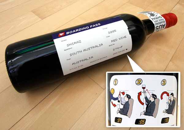
The only homework over break is for you to find a well-designed wine label. Post a picture of it to the blog.
Logo - 15 designs
Logo - final choice
Sierra Nevada Review Cover
Poster Design
Writing assignments:
Obama "O" Response
Poster Artist Paper
Shepard Fairey "Obey Plagiarist" Response
DON'T FORGET – DON'T BE LATE THIS THURS:
We're going on a field trip, don't get left behind.
The only homework over break is for you to find a well-designed wine label. Post a picture of it to the blog.
Wednesday, February 27, 2013
Poster & Reading Assignment
At the beginning of next Tuesday's class, your finished poster design is due. Also, I want you to write a series of short responses to some questions, in reaction to an online reading assignment. We'll also look at a handful of links in class:
Milton Glaser critiques Shepard Fairey.
Milton Glaser on referencing Marcel Duchamp and Islamic Painting motifs in his Dylan poster.
Here's the article on Shepard Fairey for you to read & respond to:
Obey Plagiarist Shepard Fairey, by Mark Vallen
Please answer the following questions, and print out your answers to hand in on Tuesday's class:
1. Vallen suggests Fairey has no demonstrable drawing ability, calling his art "machine art that any second-rate art student could produce." Is this an accurate appraisal of Fairey's style? Is it a relevant critique? Explain why or why not, in each case.
2. Vallen suggests that Lichtenstein's appropriation of comic strip imagery is valid, while Fairey's is not. What is the distinction he draws between the two artists? And do you think it's a valid distinction?
3. Vallen claims that the rationale behind Fairey's "Obey Giant" campaign -- to "stimulate curiosity and bring people to question both the campaign and their relationship with their surroundings - because people are not used to seeing advertisements or propaganda for which the motive is not obvious" -- is "pointless twaddle." Does he have a point, or is this in fact a decent rationale? Why?
4. Did Fairey have any sort of responsibility to recognize the skull image from the "defiant since 89" T-shirt as an SS Skull? Why?
5. Was the use of the Koloman Moser figure for the "Obey Propaganda" poster appropriate? Did Fairey make the image his own, or does it stand too much in the shadow of the original image?
6. Is Fairey's addition of an "Obey" logo to a Black Panther's beret an act of commentary, appropriation, or something else? What does the addition of the "Obey" logo do to transform the meaning of the original image?
7. What do you think Fairey's transformation of Rupert Garcia's "Down with the Whiteness" poster ultimately means?
8. Should Fairey have issued an apology to Rene Mederos, for the use of his poster image on a T-shirt?
9. Do you think that Fairey's use of Gary Grimshaw's winged panther image violates the spirit in which it was created for the "public domain?" Grimshaw says as much: "It is an icon that people can identify with and organize around, and thus must be free of copyright restrictions and onerous ownership. That is the spirit in which the image was created. The commercial exploitation of this image is not strictly criminal because of its public domain intent, but it reeks of the very mean spirit that the image was meant to oppose." Does Grimshaw have a point, or is Fairey completely in the clear in this case?
10. Towards his conclusion, Vallen states: "The expropriation and reuse of images in art has today reached soaring heights, but that relentless mining and distortion of history will turn out to be detrimental for art, leaving it hollowed-out and meaningless in the process. When I refer to "mining" in this case I mean the hasty examination and extraction of information from our collective past as performed by individuals who do not fully comprehend it. That is precisely what Fairey is guilty of, utilizing historic images simply because he "likes" them, and not because he has any grasp of their significance as objects of art or history." Is this a vlid critique of Fairey's art? What responsibility does the artist have to the history and social context of art the imagery he/she chooses to appropriate, if any?
Milton Glaser critiques Shepard Fairey.
Milton Glaser on referencing Marcel Duchamp and Islamic Painting motifs in his Dylan poster.

Here's the article on Shepard Fairey for you to read & respond to:
Obey Plagiarist Shepard Fairey, by Mark Vallen
Please answer the following questions, and print out your answers to hand in on Tuesday's class:
1. Vallen suggests Fairey has no demonstrable drawing ability, calling his art "machine art that any second-rate art student could produce." Is this an accurate appraisal of Fairey's style? Is it a relevant critique? Explain why or why not, in each case.
2. Vallen suggests that Lichtenstein's appropriation of comic strip imagery is valid, while Fairey's is not. What is the distinction he draws between the two artists? And do you think it's a valid distinction?
3. Vallen claims that the rationale behind Fairey's "Obey Giant" campaign -- to "stimulate curiosity and bring people to question both the campaign and their relationship with their surroundings - because people are not used to seeing advertisements or propaganda for which the motive is not obvious" -- is "pointless twaddle." Does he have a point, or is this in fact a decent rationale? Why?
4. Did Fairey have any sort of responsibility to recognize the skull image from the "defiant since 89" T-shirt as an SS Skull? Why?
5. Was the use of the Koloman Moser figure for the "Obey Propaganda" poster appropriate? Did Fairey make the image his own, or does it stand too much in the shadow of the original image?
6. Is Fairey's addition of an "Obey" logo to a Black Panther's beret an act of commentary, appropriation, or something else? What does the addition of the "Obey" logo do to transform the meaning of the original image?
7. What do you think Fairey's transformation of Rupert Garcia's "Down with the Whiteness" poster ultimately means?
8. Should Fairey have issued an apology to Rene Mederos, for the use of his poster image on a T-shirt?
9. Do you think that Fairey's use of Gary Grimshaw's winged panther image violates the spirit in which it was created for the "public domain?" Grimshaw says as much: "It is an icon that people can identify with and organize around, and thus must be free of copyright restrictions and onerous ownership. That is the spirit in which the image was created. The commercial exploitation of this image is not strictly criminal because of its public domain intent, but it reeks of the very mean spirit that the image was meant to oppose." Does Grimshaw have a point, or is Fairey completely in the clear in this case?
10. Towards his conclusion, Vallen states: "The expropriation and reuse of images in art has today reached soaring heights, but that relentless mining and distortion of history will turn out to be detrimental for art, leaving it hollowed-out and meaningless in the process. When I refer to "mining" in this case I mean the hasty examination and extraction of information from our collective past as performed by individuals who do not fully comprehend it. That is precisely what Fairey is guilty of, utilizing historic images simply because he "likes" them, and not because he has any grasp of their significance as objects of art or history." Is this a vlid critique of Fairey's art? What responsibility does the artist have to the history and social context of art the imagery he/she chooses to appropriate, if any?
Tuesday, February 26, 2013
Thursday, February 21, 2013
Due Tuesday, 2/26
At the beginning of Tuesday's class, you need to have a sketch of your idea for the poster design. This can just be a pencil sketch. The final design can be illustrated, or it can be photography-driven, or it ca use collage - though the images should be in the public domain, or at least tweaked enough that they could be defended on a "fair use" basis. But come to class armed with an image/idea.
In preparation, please listen to the bands in the "BAND LINKS" column to the right. Street Joy and Tasty Treat will have more information regarding venues and dates - so if you want to set integrating the text into the design as a good "design problem," pick one of those. Otherwise, let the music guide you - pick the band whose sound you respond to the most, or which gives you the strongest mental images.
In preparation, please listen to the bands in the "BAND LINKS" column to the right. Street Joy and Tasty Treat will have more information regarding venues and dates - so if you want to set integrating the text into the design as a good "design problem," pick one of those. Otherwise, let the music guide you - pick the band whose sound you respond to the most, or which gives you the strongest mental images.
Thursday, February 14, 2013
Poster Presentation

This assignment is due at the beginning of class on Tuesday, 2/19.
As a prelude to our poster project, everyone is going to do an in-class presentation on a poster artist or a poster movement, so that we get exposed to a variety of poster styles and approaches. Present images in powerpoint, or as an image slideshow. Everyone will have 10 minutes to present and take questions. In addition to the presentation, you'll need to print out and hand in a minimum three page paper (double-spaced), which will serve as an outline of your presentation. That's three written pages -- not one written page and two pages of pasted-in images. If you want to include images as supplements to the three page paper, feel free. Include a fourth page that lays out your bibliography. If you can get your hands on some actual books to bring to class to show around, please do. There are a few poster art books in Prim Library.
In your presentation and paper, give a description of the artist/movement, and what the social context for the work was. Who was the audience for the posters? What sorts of messages were they trying to convey? Who paid for the posters to be made (if relevant -- some posters, like the May '68 posters, were not commissioned)? What made the posters interesting or unique? What made them stand out? In addition to giving some biographical and social context, pick out several images that interest you, and critique them in some detail. What sorts of formal decisions make the posters "work" (or fail to work, if you think they're bad posters?)
Single out at least two posters, and write about the following elements in each poster:
Describe the qualities of the fonts, and how they are used
Describe the use of color
Describe the use of imagery
Write about the balance between text and image, and the overall composition
Describe the communicative impact of the poster
You could break down the paper in this way:
1 page of personal/cultural background to the artist/movement
1 page dedicated to a specific poster
1 page dedicated to another specific poster
1 bibliography page
Below is a list of poster artists or poster movements to choose from. Plug the name or prase into Google images and pick something that appeals to you visually. Once you've chosen, write your choice in a "comment" to this blog post -- don't pick artists/movements that have already been "claimed" in the comments section (this is first-come, first-serve). You're not restricted to this list -- if you'd like to do a presentation on some other poster artist, just name them in the comments section.
This should go without saying, but don't plagiarize. You'll get caught, and that'll suck.
The Beautiful Angle Poster Project
Art Chantry
Brian Chippendale
Shepard Fairey
Rupert Garcia (chicano movement posters)
Eugène Grasset
Gary Grimshaw (psychedelic 60s posters)
Miss Amy Jo
Judge (judgeworks.com)
Frank Kozik
Strawberry Luna
May 1968 Posters (1968 Paris Uprising, 1968 Street Posters)
Rene Mederos (and Cuban poster artists of the 1960s)
Victor Moscoco
Alphonse Mucha (and Art Nouveau)
Polish movie posters (esp. Jan Lenica)
Print Mafia
Soviet Movie Posters (esp. The Stenberg Brothers)
Soviet propaganda Posters
Théophile Steinlen
Henri de Toulouse-Lautrec
US WW2 propaganda posters
Leonetto Cappiello
Tyler Stout
(The top image is by Bay Area Chicana artist Ester Hernandez)
Tuesday, February 12, 2013
Dimensions for Sierra Nevada Review cover
If you're only doing a front cover:
8.5" Tall X 5.5" Wide (add a 1/8" bleed - set the bleed in File > Document Setup as .125")
Wrap-around cover:
8.5" Tall X 11.25" wide (this includes a 1/4" spine) - also add a 1/8" bleed.
The only text that needs to appear on the cover is:
Sierra Nevada Review
2013
8.5" Tall X 5.5" Wide (add a 1/8" bleed - set the bleed in File > Document Setup as .125")
Wrap-around cover:
8.5" Tall X 11.25" wide (this includes a 1/4" spine) - also add a 1/8" bleed.
The only text that needs to appear on the cover is:
Sierra Nevada Review
2013
Thursday, February 7, 2013
Poetry Magazine References
Past covers of the Sierra Nevada Review:
http://www.sierranevada.edu/assets/SierraNevadaReview2012.jpg
http://www.sierranevada.edu/academics/humanities-social-sciences/english/the-sierra-nevada-review/poetry/
Covers of POETRY Magazine:
http://www.flickr.com/photos/89973526@N00/sets/72157604919202281/
http://www.sierranevada.edu/assets/SierraNevadaReview2012.jpg
http://www.sierranevada.edu/academics/humanities-social-sciences/english/the-sierra-nevada-review/poetry/
Covers of POETRY Magazine:
http://www.flickr.com/photos/89973526@N00/sets/72157604919202281/
Audi: instills Bravery
-katelyn jensen
http://www.youtube.com/watch?v=GsWwbXa4fkI
In this super bowl commercial they are using the 9th format which is using ongoing characters and/or celebrities. They decided to create a dispute between two famous actors, that have appeared in plenty of films together. So they fit well together already in the commercial. But then a problem is created, they are there for the same reason, even taking the others job. But in the end, they get brushed under the table by the appearance of another celebrity, Lebron James.
In this super bowl commercial they are using the 9th format which is using ongoing characters and/or celebrities. They decided to create a dispute between two famous actors, that have appeared in plenty of films together. So they fit well together already in the commercial. But then a problem is created, they are there for the same reason, even taking the others job. But in the end, they get brushed under the table by the appearance of another celebrity, Lebron James.
E-Trade Baby
The E-Trade commercial from this years super bowl featured Gunn's ninth format of advertising. This commercial used the "symbol, analogy , or exaggerated graphic" to portray the many ways you could lose your money instead of investing with E-Trade.
Wednesday, February 6, 2013
"Space Babies" 2014 Kia Sorento Big Game Ad
This ad seems to run along the lines of the associated user imagery type. Sure there's quite the fictitious story going on, but it plays off as these are the kind of people that drive this car. It's a luxurious family car. The actors are dressed nice and are clean cut. The ad takes place (more or less) inside the cabin of the car, so there are lots of shots of the nice leather seats and the fancy touch screen panel built into the car. I'd say it's an effective ad, as the wild story taking place grabs your attention and keeps you interested enough to watch the entire commercial, allowing them to show off its features and just how fancy their touch screen computer is (you know, since it is voice activated as well).
Oreo Commercial
I think this advertisement falls into the unique personality property commercial category. Oreos are a unique cookie compared to the cookies a person bakes at home. The cookie its self is essentially two cookies with creme in the middle of them. Oreo used their unique cookie to drive an argument between two people about what the best part of the Oreo is. This commercial also falls under the category of parody. It makes fun of the fact that if you are going to argue in a library you must whisper. I feel like the commercial would not have been as funny or successful if it were in a different location without the whispering.
M&Ms Commercial
This M&Ms commercial is an example of an advertisement using the "ongoing characters and celebrities" format. Not only has M&Ms consistently used their candies as characters in many of their advertisements, in this commercial they added a celebrity as well, Naya Rivera. I feel that using ongoing characters in advertisements appeals to the consumer because it is recognizable and consistent. "A recurring character or celebrity association helps cement the brand's identity into the viewers memory." When I watched this commercial I did not find it to be extraordinarily funny or original although immediately after seeing the M&M character "Red" I recognized the brand and associated it with some of their commercials I had seen previously.
Volkswagen Commercial
The Volkswagen commercial is an example of a benefit cause story type of commercial. The ad begins with a man at work speaking with a Jamaican accent and is being super positive. His coworkers and boss are not happy so he takes them for a ride in his car and they all return happy and speaking in Jamaican accents. It is then revealed that is is because he was driving a Volkswagen. "You Conceive the ad back - to - front, by imagining a trail of events that might be caused by the product's benefit" which is one of the characteristics of the benefit cause story types of ad. I think that this is an effective ad because it is funny and gets the viewers attention, the commercial made me happy so I feel that the product will also make me happy.
Go Daddy "Perfect Match" Commercial
The always edgy Go Daddy released the commercial to portray its "sexy" layout and "intelligent" interface. Claiming it has both sides of these sides to it, and together it makes Go Daddy unique. I think that this ad shows "symbol, analogy, or exaggerated graphic and" "unique personality property." It makes the analogy of "sexy" and "nerdy" saying the company has both of these qualities about them. I also could see it fall under the "unique personality propert," because it says that these qualities make them unique.
Will Ferrell's Old Milwaukee Super Bowl XLVII Commercial
Old Milwaukee's Superbowl commercial featuring Will Farrell is an ongoing celebrity appearance ad and a parody. This commercial is not your run of the mill Super Bowl ad. First it was only aired in 3 small mid west cities: Sherman, Texas, Ardmore, Oklahoma and Glendive, Montana. Also, Kate Upton was paid an estimated 1 million dollar for the Mercedes- Benz Super Bowl commercial. Will Farrell did this, and all of his Old Milwaukee, commercials for free. "[These commercials have] given creative freedom to revive a brand and shoot crazy fun commercials," Farrell told Eater San Diego in December. as for the striking similarities with the Go Daddy commercial,coincidence or hilarious parody brought on by leaked information?
Tuesday, February 5, 2013
Carl’s Jr. “Sun Tan” Super Bowl Ad
This is the Carl’s Jr. “Sun Tan” Super Bowl Ad Director’s Cut featuring Nina Agdal.
The fast food chain’s “Sun Tan” ad uses "benefit causes story" by imagining a trail of events that might be caused by the product's benefit. In this example, we see an attractive Nina Agdal enjoying Carl’s Jr.’s new Charbroiled Cod Fish sandwich. "The product's benefit—beguiling women to the point of dementia—creates the story."
#Go Pro's - #Dub-step - #Babies = WIN

GoPro has done it again, after a huge promotional weekend of the X-games and a hilarious Kitty Gopro Commercial, GoPro and the Super-Bowl brought us Babies and Dub-step. In this Ad, GoPro uses Gunn's first format which is "demo." but also incorporates a self aware "parody" of itself as well. I wasn't incredibly stunned by the Super-Bowl commercials, but I thought this was a cute, humorous, and witty piece of advertisement. What do you think?
Union Binding Company
The Union “U” logo embodies all
qualities of a sound logo. Their bindings have usually have intriguing designs
and colors on them, but the bindings are made a strong, light, and simple. no
bells and whistles.
The U itself always has a line with
a small triangle protrusion on the bottom of it. This gives it a silhouette of a bolt, which
is synonymous with strongly holding two objects together. That is exactly what
they do; strongly hold you to your board.
There signature color is a very
bright orange, the color commonly associated with construction. It immediately
conveys a tough and rugged feel. The logo is exactly as the founders of union
described the company, “ No bullshit, Premium Materials.”
LOGOS
Here are the parameters of your logo assignment. It would probably be good to have a sheet of sketches for several logo ideas. I will want to see 15 prospective variations of your logo design, broken down as follows:
a) Five logos that are purely font-based (you can, and probably should, tweak with the font letterforms, but the logo itself should be formed only out of text)b) Five logos that also incorporate some sort of abstract shape that somehow supports the "tone" of the business (for example, the Nike "swoosh," which is an abstract shape, but which connotes speed, energy, etc)c) Five logos that incorporate some sort of pictographic "icon" -- a simplified version of something representational (for example, the way the NBA logo has a silhouette of a basketball player)
We'll continue with the logo design through next class period -- that will be the last in-class period to work on the logo designs. The 15 versions of the logo will be due at the beginning of class next Tuesday (a week from today). From there. we'll review the logos, pick out the most promising design(s), and work on refining those designs.
SUPERBOWL AD ASSIGNMENT
For next class, I'd like you to read/view a couple of articles about "the 12 Types of Advertisement" – as classified by creative director Donald Gunn, way back in 1978.
Here's a six-minute video about the 12 types:
http://www.mediabistro.com/unbeige/donald-gunns-12-types-of-tv-advertising_b3604
And here's a transcript of that video, just for easier textual reference - it has some example ads embedded, although unfortunately a good chunk of the embed are no longer working (the ads are excerpted in the above video, anyway):
http://adsoftheworld.com/blog/ivan/2007/jul/24/12_kinds_of_advertisements
I want you to pick out one of this weekend's superbowl ads (you can google "superbowl ads"), embed it on this blog, and write which of the 12 ad types you think it is, giving supporting examples for your classification. Also, write whether you think it's an effective ad or not – and give your reasons. Please check in on this blog to see if the ad you're picking has already been taken.
SNR COVER
Deadline Feb 15
Thursday, January 31, 2013
Nike Swoosh

logo response

Wednesday, January 30, 2013
Some IIlustrator references to help with logo design
Here are some links to support some Illustrator tools I'll be showing in class:
Pathfinder panel
Blending Tool
Convert text to outlines
3D Extrude & Bevel
Image Trace
Illustrator grid
Pathfinder panel
Blending Tool
Convert text to outlines
3D Extrude & Bevel
Image Trace
Illustrator grid
Katelyn Jensen
Blog post
29, January 2013
Smart logo

This logo is very effective.
The font and the color give off
futuristic qualities and care-free fun as well.
 The grey color against the white is what sets the more
futuristic tone. Whenever I see a movie
that is suppose to be set in the future, the space is normally filled with grey
and white for example: the movie, In Time, is set in the future and of
course it has the stealthy grey and
white color effect that forshadows to
the audience that this movie is futuristic.
Wii probably wanted to foreshadow this as well, because it began a whole
new era for video games with a huge leap in improving interactivity.
The grey color against the white is what sets the more
futuristic tone. Whenever I see a movie
that is suppose to be set in the future, the space is normally filled with grey
and white for example: the movie, In Time, is set in the future and of
course it has the stealthy grey and
white color effect that forshadows to
the audience that this movie is futuristic.
Wii probably wanted to foreshadow this as well, because it began a whole
new era for video games with a huge leap in improving interactivity.
The font style along with the actually name for Wii products
gives me a feeling that this product is “fun.” The soft rounded lower case
lettering seems less profession than straight boxy capitalized lettering. This is a good thing because most of their target
market is youthful gamers looking for a good time. Pepsi recently used this same method in trying to make their product more
youthful. They changed their lettering
to all lower case and the font was changed by making it rounder and less
formal, something that may psychologically appeal to a younger customer.
STS9

a) color - Their colors always vary but their inspirations are nothing short of psychedelic
b) font - STS9 is always uses the same spacing tightly flowing from one letter to the next. A futuristic looking font, it fits perfectly for their forward thinking ideology.
c) imagery - STS9's images always depict divine and sacred symbols while compiling these resources from a diverse cultural and historical background. The result is a hypnotic ballad of human history through music and imagery.
Tuesday, January 29, 2013
Chelsea Christoph- Elephant combs

I think that the Red Bull logo is a particularly good because it symbolizes what the product is meaning to achieve or what the consumer is looking to gain from the product. The Red Bull logo is two red bulls charging against each other in front of a yellow spot. The bulls represent power, speed, and aggressiveness. This makes sense because Red Bull is an energy drink marketed towards extreme sports. The logo is saying that if you drink this product you will get more strength and speed and perform better. I think that the yellow circle represents energy and the blue and silver represent calm and intellect.
The font used for the logo seems modern and new. The Logo visually represents everything that to Red Bull is trying to tell consumer that the brand is about and what they will gain from drinking it, and it appeals to a young/ hip demographic.

Redbull does a great job of placing
their logos in strategic places. You see it a lot, but it isn't
excessive to the point where it just blends in.
A) color – Letters in red make it
seem more sharp, also with the blue/grey back drop it almost glows.
B) font – standard letters, nothing
fancy,
C) imagery – use of the toro roso –
Strong imagery from the past and for the future.
Diva Helmy: Volcom Stone
Hello!
I chose to comment upon the logo of the
action sports company Volcom, the Volcom stone. I believe that this logo is
unique and strong. The symbol itself is recognizable and between its name “the
volcom stone” and the font choice underneath it I think it has an organic and
raw quality that sparks interest and energy. The sharp contrast between the
colors used, black and white is timeless and effective at portraying bold
geometric shapes. The feelings I have when I look at this logo are action,
chaos and quality. Its almost like the logo is a precious gem of some sort, which
adds consumer value and a strong appeal. The logo is exciting much like the
company it represents.

Monday, January 28, 2013
Twitter Logo Designs
Here are a couple links about designing the Twitter logo:
Interview with designer Phil Pascuzzo, who redesigned the Twitter bird in 2009.
Concept sketches for the bird redesign in 2012.
2012 Twitter bird design guidelines.
Interview with designer Phil Pascuzzo, who redesigned the Twitter bird in 2009.
Concept sketches for the bird redesign in 2012.
2012 Twitter bird design guidelines.
Friday, January 18, 2013
Spring 2013 Intermediate/Advanced Digital Darkroom: Welcome!
Welcome to the Blog for the Intermediate Digital darkroom class: Art & Advertising.
And first off – apologies for my impending absence next Thursday. You get to take Thursday "off," meaning you don't have to come to class that day – but there is some homework due a week from today, so we can hit the ground running.
For the next Tuesday's class (1/29), I want you to have ready, at the beginning of class, three things – a printed out reading response, a blog post, and sketches for a logo you will design. See below for details.
2. BLOG POST: Create a blog post, on this blog, about a logo design you think is particularly good. Include an image of the logo. In the blog post, answer the question: why do you think this logo is a good design? Be sure to touch on at least these three areas:
a) color
b) font
c) imagery (if imagery is used)
Explain the emotional or psychological qualities that are conveyed by the formal choices in these areas. For example, if the font uses a bright, vibrant color, is it being used to convey a sense of excitement? Energy? What are the company's qualities that are being cued by the formal choices?
3. LOGO DESIGN SKETCHES: Our first project in this class will be to design a logo – we'll use Adobe Illustrator to execute the design. I'm going to have you design multiple alternate designs for your logo, but to start off, for Tuesday's class, I just want you to hand in one sketch of your logo (it can be pencil, or a digital "sketch" – or anything in between). This can be a logo for yourself – if you were somehow promoting yourself. Or it can be a logo for an actual company you'd like to start – or a logo for an entirely fictional company (if it's a fictional company, you'll have to be able to explain what sort of fictional company it is – a tech company, a movie studio, a sports drink company – whatever it might be).
And here's a link to "Merchants of Cool," if you ever want to revisit it, or dig info some further research/supporting materials on it:
http://www.pbs.org/wgbh/pages/frontline/shows/cool/
Lastly, you can download the syllabus here:
Intermediate Digital Darkroom:
https://www.box.com/s/icik24hw8ouk8f9vxx9f
Advanced Digital Darkroom:
https://www.box.com/s/dwuqrcyfsdv4vz2j4ta2
And first off – apologies for my impending absence next Thursday. You get to take Thursday "off," meaning you don't have to come to class that day – but there is some homework due a week from today, so we can hit the ground running.
For the next Tuesday's class (1/29), I want you to have ready, at the beginning of class, three things – a printed out reading response, a blog post, and sketches for a logo you will design. See below for details.
1. READING RESPONSE: After having read the three articles posted below, type out and print a page of answers to the following questions:
In response to the Obama 'O' logo article: Why were the designers so concerned about having standards and consistency around the reproductions of the logo? What would the dangers have been if the logo seemed too "branded" or "slick"? Make a list of the specific qualities or emotions you think the logo evokes (or intends to evoke), and pair each quality with a design element (for example, one emotion it intends to evoke is "patriotism," and it does this by incorporating the colors red, white, and blue).
In response to the Pepsi articles: Do you agree with the designer that the new logo "brings humanity back" to the Pepsi? What do you think he means by that? What design choices were made to make the logo seem more "adventurous" and "youthful"? Do you think the design succeeds in those categories? What are the emotional qualities of the new font choice? Why is changing a logo so costly?
Here are the articles:
That last post is on a site, logodesignlove, that has some terrific resources, for example:
2. BLOG POST: Create a blog post, on this blog, about a logo design you think is particularly good. Include an image of the logo. In the blog post, answer the question: why do you think this logo is a good design? Be sure to touch on at least these three areas:
a) color
b) font
c) imagery (if imagery is used)
Explain the emotional or psychological qualities that are conveyed by the formal choices in these areas. For example, if the font uses a bright, vibrant color, is it being used to convey a sense of excitement? Energy? What are the company's qualities that are being cued by the formal choices?
3. LOGO DESIGN SKETCHES: Our first project in this class will be to design a logo – we'll use Adobe Illustrator to execute the design. I'm going to have you design multiple alternate designs for your logo, but to start off, for Tuesday's class, I just want you to hand in one sketch of your logo (it can be pencil, or a digital "sketch" – or anything in between). This can be a logo for yourself – if you were somehow promoting yourself. Or it can be a logo for an actual company you'd like to start – or a logo for an entirely fictional company (if it's a fictional company, you'll have to be able to explain what sort of fictional company it is – a tech company, a movie studio, a sports drink company – whatever it might be).
And here's a link to "Merchants of Cool," if you ever want to revisit it, or dig info some further research/supporting materials on it:
http://www.pbs.org/wgbh/pages/frontline/shows/cool/
Lastly, you can download the syllabus here:
Intermediate Digital Darkroom:
https://www.box.com/s/icik24hw8ouk8f9vxx9f
Advanced Digital Darkroom:
https://www.box.com/s/dwuqrcyfsdv4vz2j4ta2
Subscribe to:
Posts (Atom)