Katelyn Jensen
Blog post
29, January 2013
Smart logo
This logo is very effective.
The font and the color give off
futuristic qualities and care-free fun as well.
 The grey color against the white is what sets the more
futuristic tone. Whenever I see a movie
that is suppose to be set in the future, the space is normally filled with grey
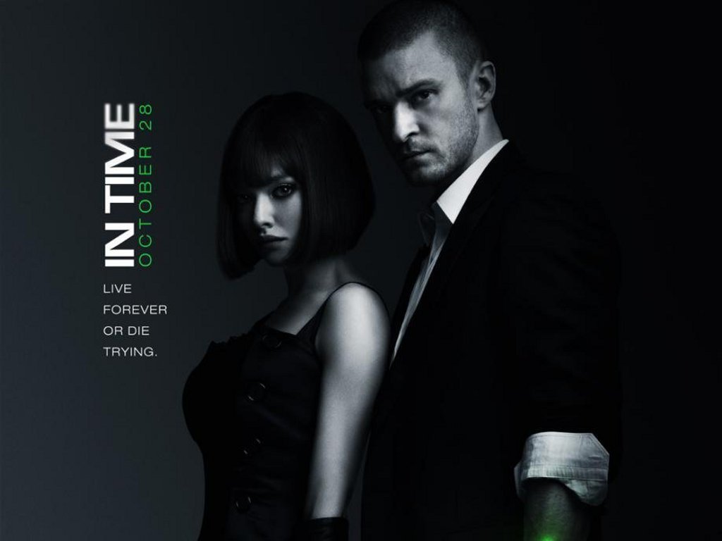
and white for example: the movie, In Time, is set in the future and of
course it has the stealthy grey and
white color effect that forshadows to
the audience that this movie is futuristic.
Wii probably wanted to foreshadow this as well, because it began a whole
new era for video games with a huge leap in improving interactivity.
The font style along with the actually name for Wii products
gives me a feeling that this product is “fun.” The soft rounded lower case
lettering seems less profession than straight boxy capitalized lettering. This is a good thing because most of their target
market is youthful gamers looking for a good time. Pepsi recently used this same method in trying to make their product more
youthful. They changed their lettering
to all lower case and the font was changed by making it rounder and less
formal, something that may psychologically appeal to a younger customer.

No comments:
Post a Comment